Many Shopify store owners put significant resources into driving traffic, but the sales are average. And the argument starts whether its the problem with the traffic from ads, organic, etc or with the product page.
This is a problem we see time and time again. In fact, over 70% of online shoppers abandon their carts before making a purchase, which means that even if you’re getting traffic, it’s not guaranteed that those visitors will complete the transaction.
And who are we to talk about all these?
We run ConversionAB, specialising in optimising Shopify stores for higher sales. Through conversion rate optimisation (CRO) techniques, we’ve helped countless store owners transform their traffic into tangible sales. Based on years of experience and research, we’ve identified several key elements that can make or break a product page.
In this blog, we’ll dive into some of the most effective product page examples from well-known brands. We’ll break down exactly what makes these pages so successful and show you how to apply these same principles to your own Shopify store.
Best Converting Product Website Examples
1. Fenty Beauty – Cosmetics & Inclusivity
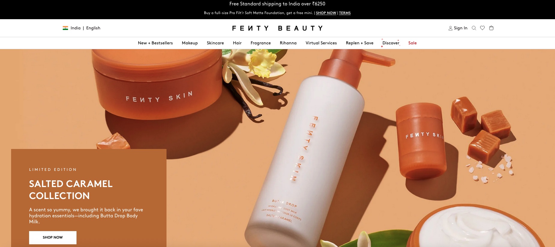
Fenty Beauty, founded by Rihanna, has set a high bar for inclusivity in cosmetics. Their product pages are designed to highlight diversity, making it clear that their products are for everyone.
What Makes It Work:
- Diverse Models: Fenty Beauty features a wide range of skin tones across its product pages, allowing customers to see how products will look on different skin types. This has helped them gain a loyal customer base from all walks of life.
- Clear Value Proposition: Each product page highlights unique selling points and benefits clearly, making it easy for visitors to understand why Fenty Beauty is different.
- Engaging Visuals: High-quality product photos and videos create an engaging shopping experience.
Why It Worked:
The inclusivity and clear communication of product benefits resonate with a broad audience, allowing Fenty Beauty to build a community-driven brand and high engagement.
2. MCoBeauty – Makeup & Skincare
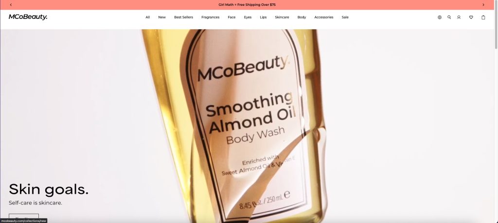
MCoBeauty’s product pages excel in simplicity and clarity. The design focuses on making it easy for customers to understand each product’s benefits and how it can enhance their skincare or makeup routine.
What Makes It Work:
- Easy Navigation: Their website uses simple layouts with clear call-to-action buttons like “Add to Cart,” making it easy for customers to quickly make a purchase decision.
- Strong Product Descriptions: MCoBeauty provides detailed descriptions of each product’s features and benefits, making it easier for customers to trust the product before buying.
- Pricing Transparency: The prices are clearly displayed with no hidden fees, which boosts trust.
Why It Worked:
MCoBeauty’s no-fuss, clear product pages make the shopping experience seamless, and their strong focus on transparency builds customer confidence, which leads to higher conversions.
3. Arctic Fox – Hair Color & Care
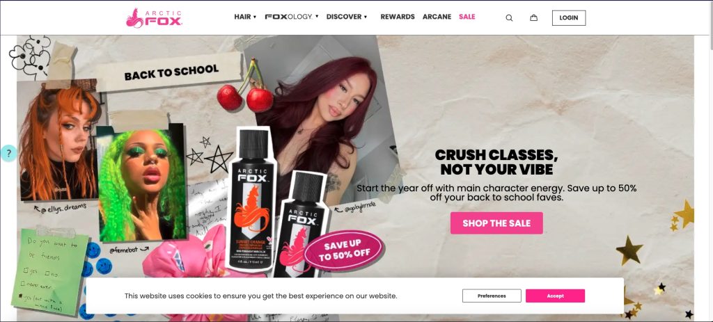
Arctic Fox’s product pages focus on sustainability and vibrant, long-lasting hair color. They’ve made an art of combining eco-friendly values with high-performance products that stand out in a competitive market.
What Makes It Work:
- Eco-Friendly Messaging: Arctic Fox clearly states their commitment to vegan and cruelty-free products, which appeals to environmentally conscious buyers.
- Social Proof: The product pages feature customer photos and reviews, allowing visitors to see how the products perform in real life.
- Bold Visuals: The use of vibrant colors in both product images and page design aligns with the brand’s personality and encourages exploration.
Why It Worked:
By aligning their brand values with their product offering and showcasing real customer experiences, Arctic Fox builds trust and engagement, leading to better conversion rates.
4. Pixi Beauty – Skincare & Cosmetics
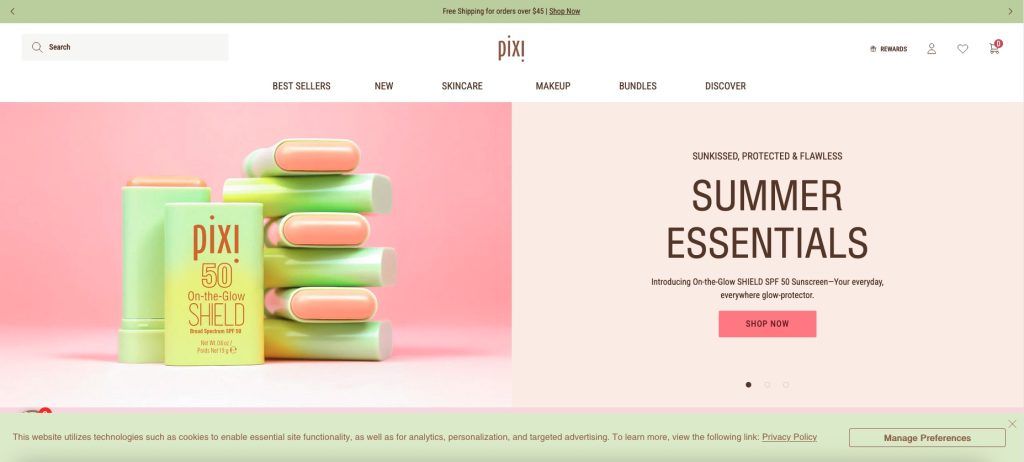
Pixi Beauty’s product pages shine with their clean, fresh look and customer-focused approach. They make it clear that their products are for everyday beauty routines with a focus on natural ingredients.
What Makes It Work:
- Simple, Attractive Design: The product pages are designed with a clean, minimalist aesthetic that puts the focus on the product itself.
- Ingredient Transparency: Pixi lists all the key ingredients in each product, giving customers insight into the quality of what they’re purchasing.
- Before-and-After Photos: Many product pages feature real customer photos showing the effectiveness of the products.
Why It Worked:
Pixi Beauty builds trust through transparency and customer-centered design, which increases engagement and drives conversions.
5. Young Nails – Nail Products
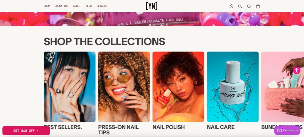
Young Nails has created an effective e-commerce experience for nail care and salon products. Their product pages are designed to be both educational and actionable.
What Makes It Work:
- Professional Appeal: The product pages cater to nail professionals, showcasing how each product fits into professional-level nail care.
- Clear Instructions: They provide detailed instructions and tips on how to use the products, adding value for the customer.
- High-Quality Imagery: Each product is displayed with high-quality images, including close-ups and detailed shots of textures.
Why It Worked:
By providing professional insights and clear usage instructions, Young Nails makes customers feel more confident about using their products, which directly contributes to higher conversions.
6. Glossier – Minimalist Skincare & Makeup
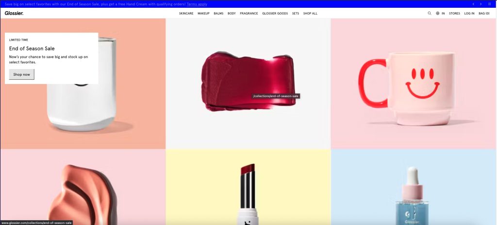
Glossier’s product pages focus on simplicity, with a strong emphasis on skincare routines. They’ve mastered the art of minimalism by offering customers exactly what they need without overwhelming them with information.
What Makes It Work:
- Minimalist Design: The pages are clean and easy to navigate, with simple product descriptions and a focus on the essentials.
- Social Proof: Glossier showcases customer reviews, along with user-generated content, to increase credibility.
- Product Recommendations: The pages often recommend related products, increasing the average order value.
Why It Worked:
By keeping the user experience simple, Glossier ensures customers can easily understand the value of each product. The minimalist design and social proof increase trust and conversions.