FixMyStore Analysis
hiutdenim.co.uk
59/100
FMS score
18 Opportunities to Increase Sales!
7
Home page
4
Collection page
5
Product page
2
Cart page
Based on our audit, 59% is your Fix My Store score (FMS score)
homepage
There are no new offers/ promotional things running on top of the banner. Telling people to sign up for the newsletter isn't the right message.▼
There are no new offers/ promotional things running on top of the banner. Telling people to sign up for the newsletter isn't the right message.
Solution
Placing offers in this banner will help customers quickly learn about recent promotions.
Example Reference
It is hard to find different categories at a single glance. Visitors might be looking for a specific category.▶
The menu bar is not optimized for easy navigation for multiple products and categories.▶
Lifestyle-oriented product visuals are missing from the homepage. Visitors couldn't identify the exact use of each product.▶
There are no customer testimonials or anything else that creates social belonging for the visitors.▶
The brand story is missing on the homepage. For a visitor who visits for the first time, they don't know the purpose of the brand.▶
There is no category named "trending" where the latest products are listed▶
collection
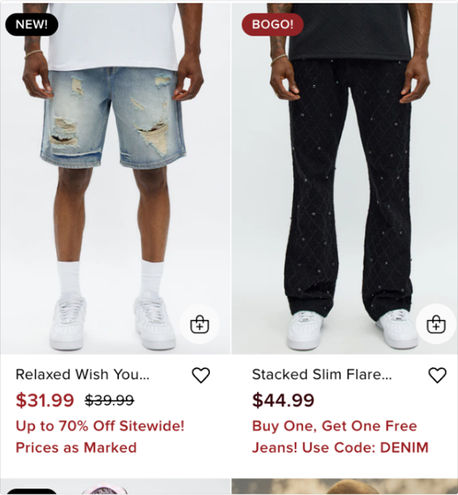
A promotional message is missing near the image.▼
A promotional message is missing near the image.
Solution
Add a promotional message near at least the first two visuals.
Example Reference
Easy option to choose different colors is absent. Each visitor might prefer a different colour.▶
"Quick add to cart" or "Wish list" button is missing in visuals. Visitors might be looking to add the product to the cart quickly.▶
A banner is missing in the top banner. This banner can convey the intended message.▶
product
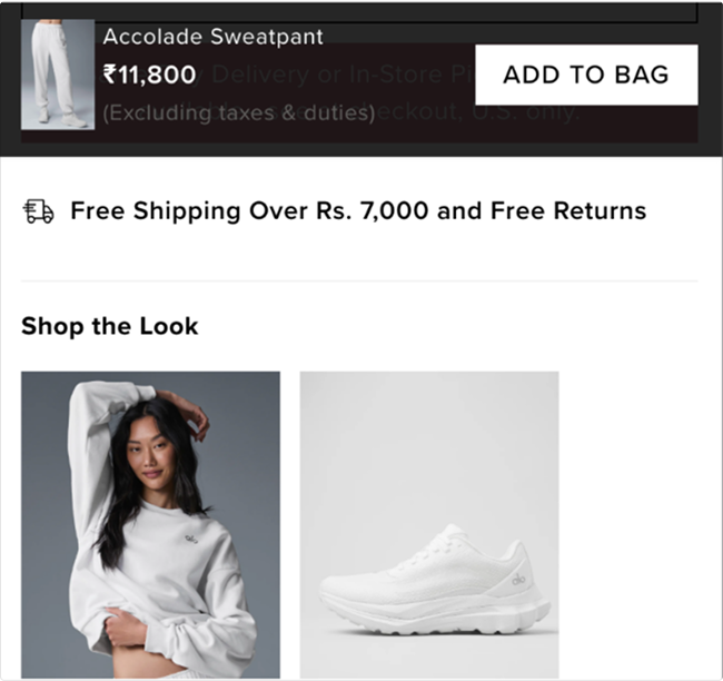
Visitors don't have the option to add a product to the cart once they scroll down. People might miss out on adding products.▼
Visitors don't have the option to add a product to the cart once they scroll down. People might miss out on adding products.
Solution
Add a "sticky add to cart" button, so visitors can add products at any time.
Example Reference
Lacks reviews or testimonials to build trust in the brand and product.▶
The size and color guide isn't placed in an easily accessible way. Visitors might want to see the different variations of a product.▶
Reviews are missing near product visuals, and this can reduce trust in the product▶
No mention of payment methods or the option to pay in instalments (EMI).▶
cart
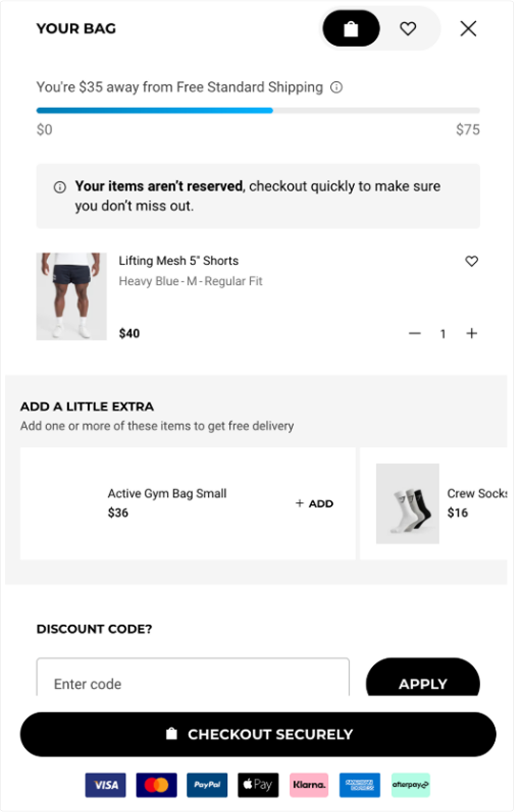
Not upselling or cross-selling opportunities on the cart page.▼
Not upselling or cross-selling opportunities on the cart page.
Solution
Use apps to enable upselling or cross-selling in the cart.
Example Reference