doyoueven.com
Design Overview
Category
Fitness & Sportswear
Country
United States
Style
Modern
Industry
Sports
Layout
Full-width
Color Palette
The Shopify store has a modern and athletic design. The layout is clean, with a focus on product imagery. The color palette is mostly neutral with accents of dark green and teal, contributing to a sporty and confident brand image.
Homepage
Sections Identified (6)
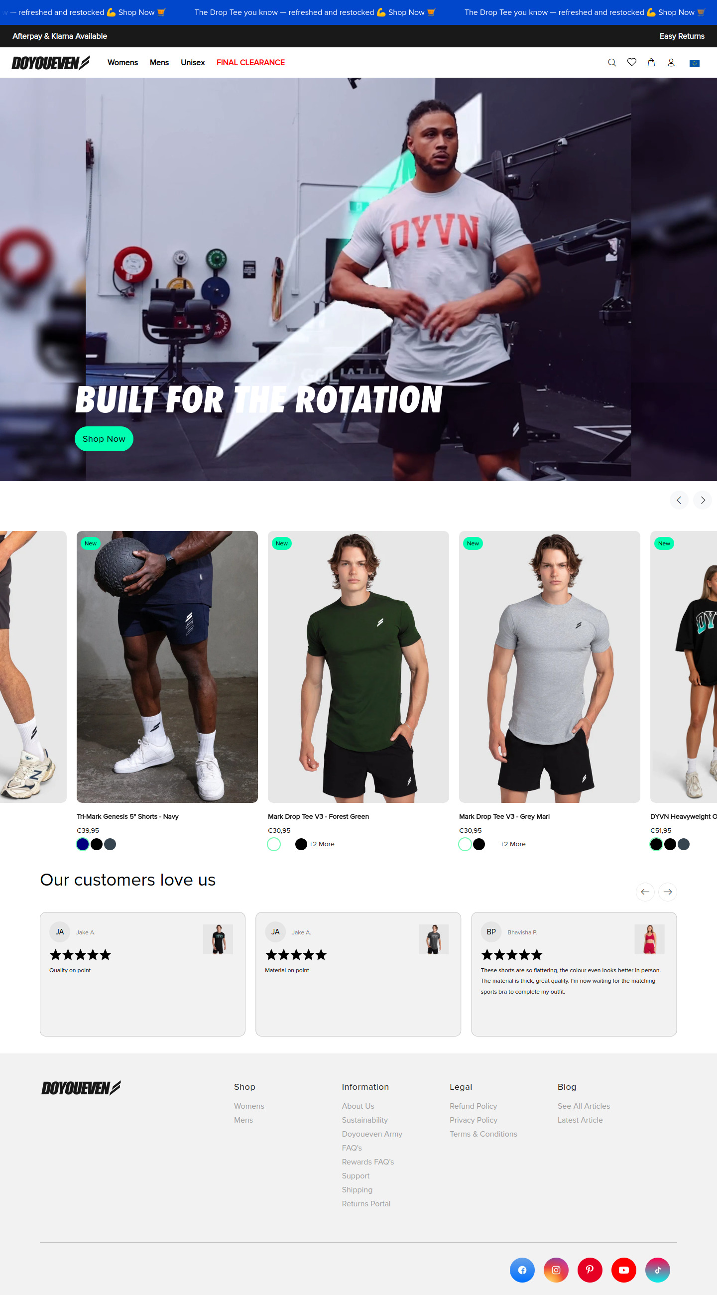
Announcement Bar
announcement-barA thin bar at the very top provides shipping information and mentions Afterpay and Klarna. The text alternates between colors.
Uses a dark background and contrasting white text. Includes links with a darker shade when hovered.
Navigation
navigationTop navigation with links to Womens, Mens, Unisex and Final Clearance.
Simple text-based navigation with a clear sans-serif font. Includes search, wishlist, and cart icons on the right.
Hero Banner
heroA large hero image with a man wearing the brand's clothing in a gym setting. Features headline text overlayed on the image and a prominent CTA button.
High-quality lifestyle image. The headline is large and bold. The 'Shop Now' CTA button is bright green, contrasting with the dark background.
Featured Products
featured-productsA carousel of featured products, each displayed with an image, name, and price.
Clean product presentation with consistent image sizes. Small 'New' badges on products. Color swatches are shown for product variations.
Testimonials
testimonialsCustomer reviews presented in a carousel format. Each review includes a star rating, customer name, and written feedback.
Simple card design with a light background. Star ratings are prominently displayed. Includes customer avatars and small testimonials.
Footer
footerThe footer contains links to shop information, legal pages, and blog.
Minimalist footer with a simple layout. Includes social media icons at the bottom.
Summary
The homepage design is clean and modern, aiming to showcase the brand's athletic aesthetic. The use of high-quality imagery, clear typography, and strategic CTAs contributes to a positive user experience. The overall design is well-structured and easy to navigate.
Collection Page

Sections Identified (5)
Announcement Bar
announcement-barA blue announcement bar at the very top provides store-wide information.
The background color is a dark blue. Text is in white for high contrast.
Navigation
navigationThe navigation bar contains the store's logo, navigation links, and cart/account icons.
The logo is placed on the left and navigational links are centered.
Collection Title
bannerA title area that likely indicates the name of the collection, and potentially a short description.
The title "All (188)" is visible indicating the page is displaying all available products. The text appears to be bold.
Product Grid
product-gridA grid of product listings that display the product image, title, and price.
Products are arranged in a three-column grid. Each product listing contains an image with a white background, product title, and price. There are circles displayed indicating color options for each product. A small teal square is visible on some products, likely indicating it's a new or special item.
Footer
footerStandard website footer, with navigation to shop, information, legal, and blog pages.
The footer section is in light gray with black text. It contains multiple columns with links. The company logo is also visible.
Summary
The collection page uses a clean and simple grid layout which allows the products to stand out. The use of white space and consistent product photography contributes to a professional and visually appealing shopping experience. The design is functional, focusing on ease of navigation and product discovery.
Product Page
Sections Identified (7)
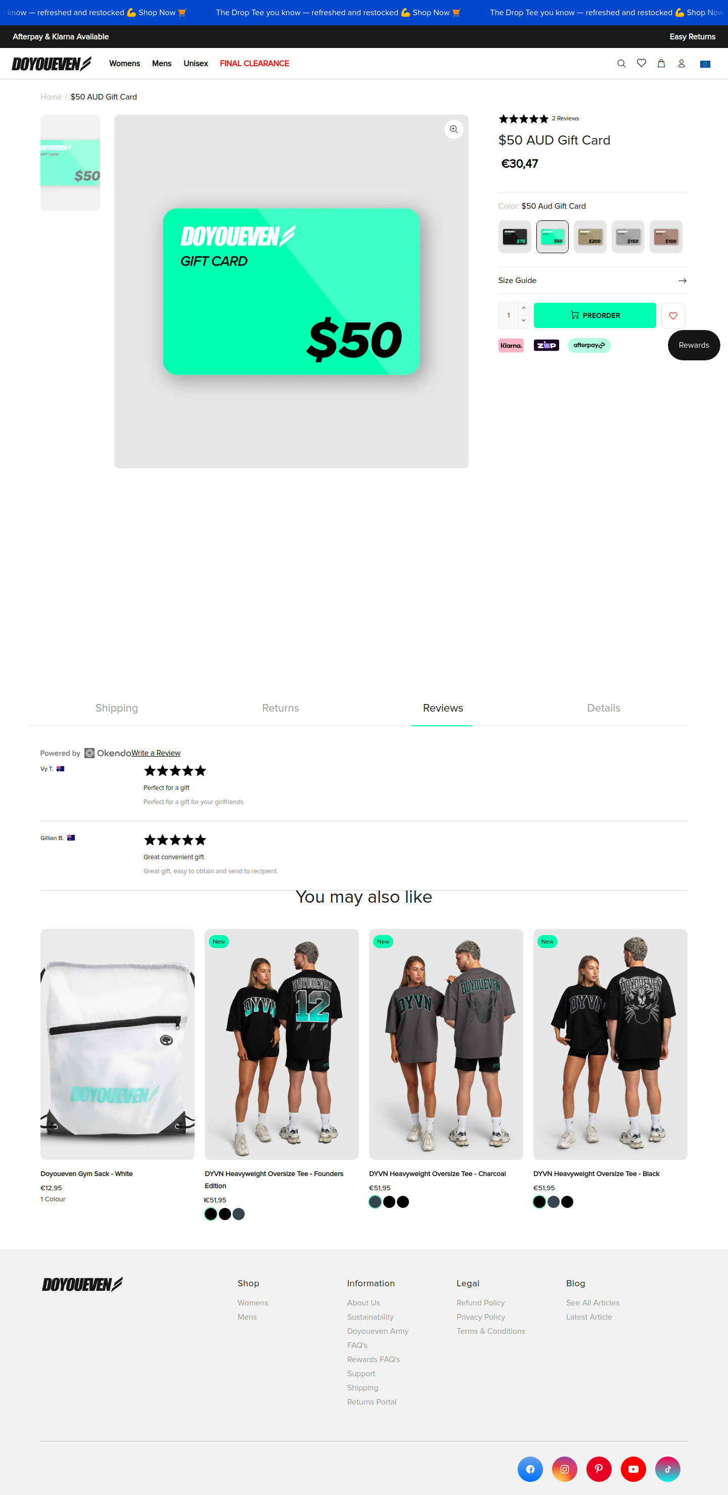
breadcrumbs
breadcrumbsNavigation breadcrumbs showing the current product's location within the website hierarchy. It displays 'Home / $50 AUD Gift Card'.
Simple text-based breadcrumbs. Uses the primary brand color for active page linking.
product-image
product-detailsMain product image of a digital gift card. It's the focal point of the page, displayed prominently.
Large, high-quality image with a zoom functionality. Simple, light grey background to ensure that the product stands out.
product-information
product-detailsProduct title, reviews, price, color selection, and add-to-cart functionality. Provides essential details about the product.
Clear typography and a streamlined layout. Color selection is displayed as image variants. Prominent 'PREORDER' button with brand color. Includes rewards badge.
Shipping, Returns, Reviews, Details Tabs
shipping-infoTabs for displaying shipping, returns, reviews and details information.
Light grey text and a horizontal line to divide sections. Reviews has a light green highlight showing it is the current tab section.
reviews
reviewsDisplays product reviews from customers. Includes star ratings and written comments.
Reviews are structured with author information, star ratings, and brief comments.
you-may-also-like
related-productsDisplays a curated selection of similar or related products, encouraging further browsing and purchases.
Carousel of product thumbnails with the 'New' tag. Minimalist product descriptions with prices and color options.
footer
footerStandard website footer containing links to shop, information, legal policies, and the blog.
Organized into columns with clear headings. Includes social media links at the bottom. Uses a light grey color for the background and text.
Summary
This product page utilizes a clean and modern design with a focus on visual clarity. The prominent product imagery and clear call-to-action make it easy for customers to engage. The use of whitespace and a restrained color palette enhance the overall user experience.
Cart Page
Sections Identified (5)
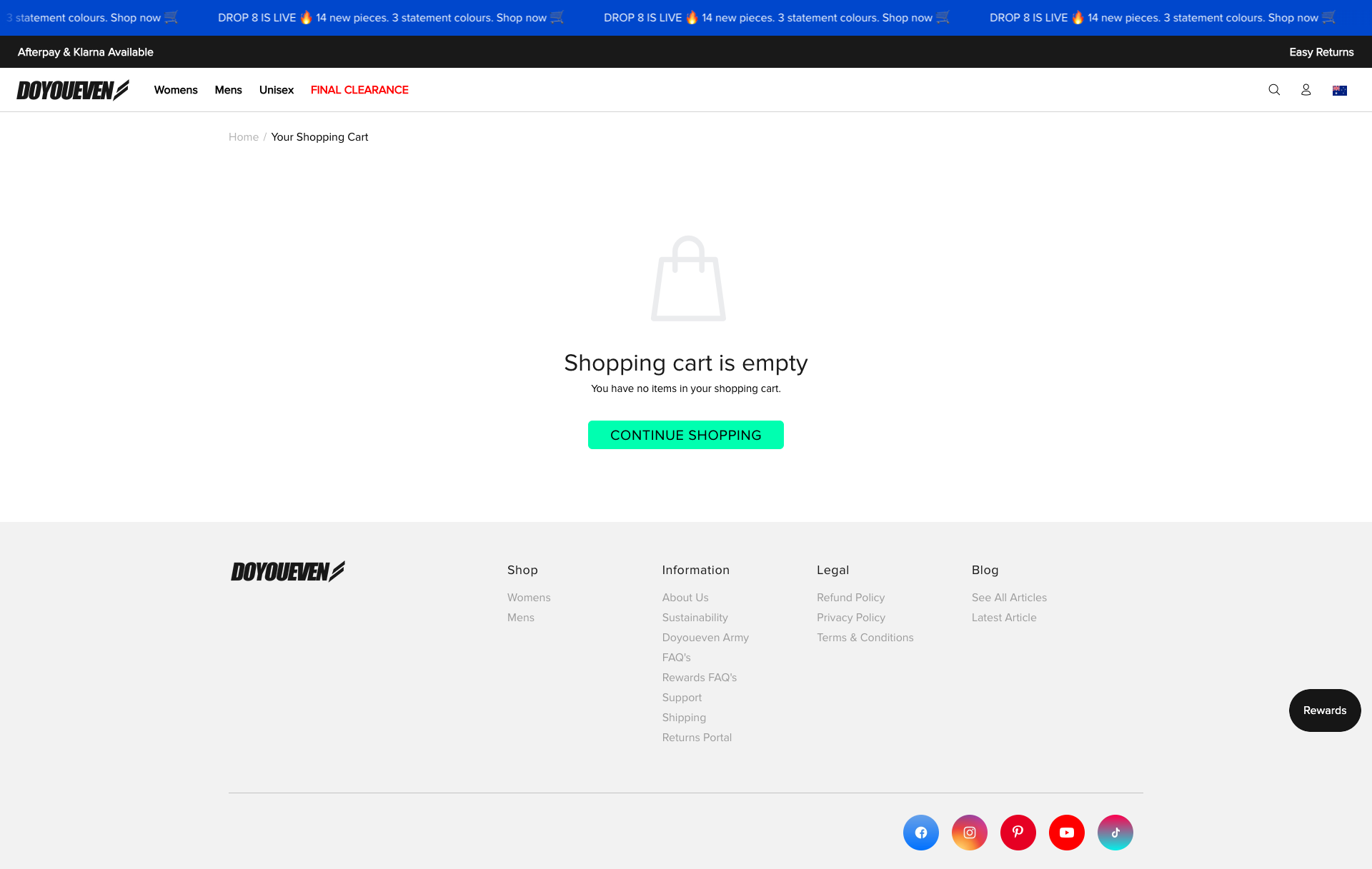
Announcement Bar
announcement-barA dark blue bar at the very top of the page containing promotional information, repeated multiple times.
Uses a dark blue background with white text and a shopping cart icon. The text is repeated several times to ensure visibility. Font size is small.
Header
navigationThe header section contains the brand logo, navigation links (Womens, Mens, Unisex, Final Clearance), and account/search icons.
Minimalist design with a white background. Logo is on the left, navigation links are centered, and account/search icons are on the right. A thin grey line separates it from the body.
Breadcrumbs
breadcrumbsNavigational breadcrumbs showing the user's current location on the site.
Light grey text. Provides simple navigation back to the homepage.
Empty Cart Message
add-to-cartA central section indicating that the shopping cart is empty with a corresponding message and CTA.
Includes an empty shopping bag icon, a 'Shopping cart is empty' message in a large font, and a supporting text in smaller font. The "Continue Shopping" button is bright teal (#12F7B6).
Footer
footerThe footer contains links to shop categories, information, legal pages, blog, and social media.
White background with light grey text. Links are grouped into columns. Social media icons are circular with corresponding brand colors.
Summary
The cart page utilizes a minimalist design to clearly communicate an empty cart state and guide the user towards continuing shopping. The simple color palette and prominent CTA button contribute to a user-friendly experience.