celestialperfume.in
Design Overview
Category
Perfume & Fragrance
Country
India
Style
N/A
Industry
N/A
Layout
N/A
Color Palette
Homepage
No analysis available for this page.
Summary
Design analysis failed for home page.
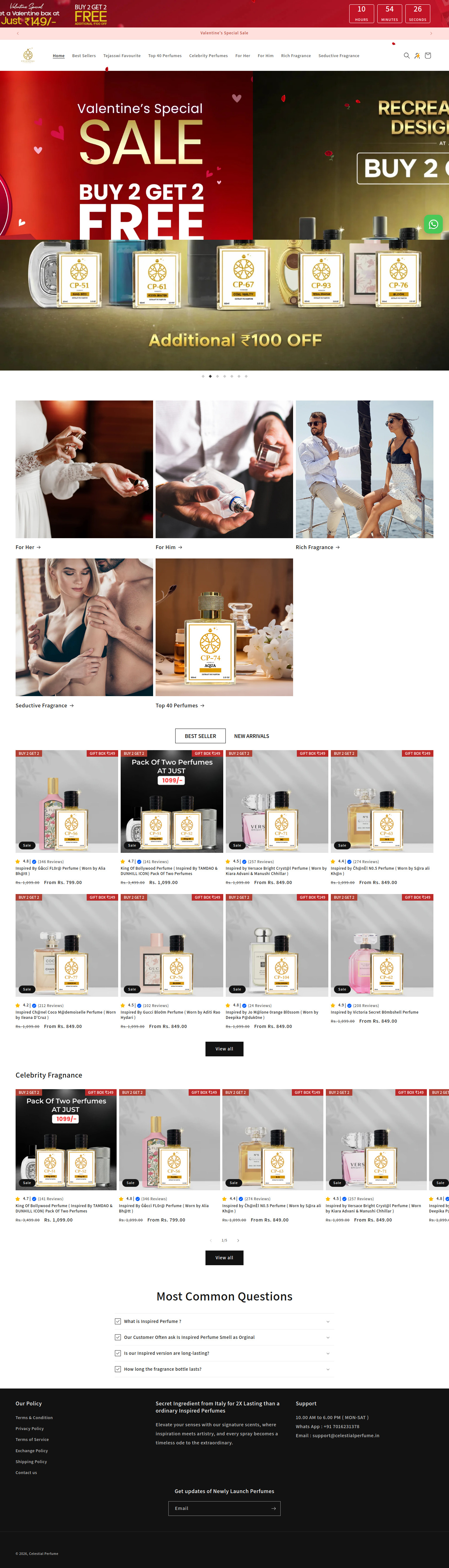
Collection Page
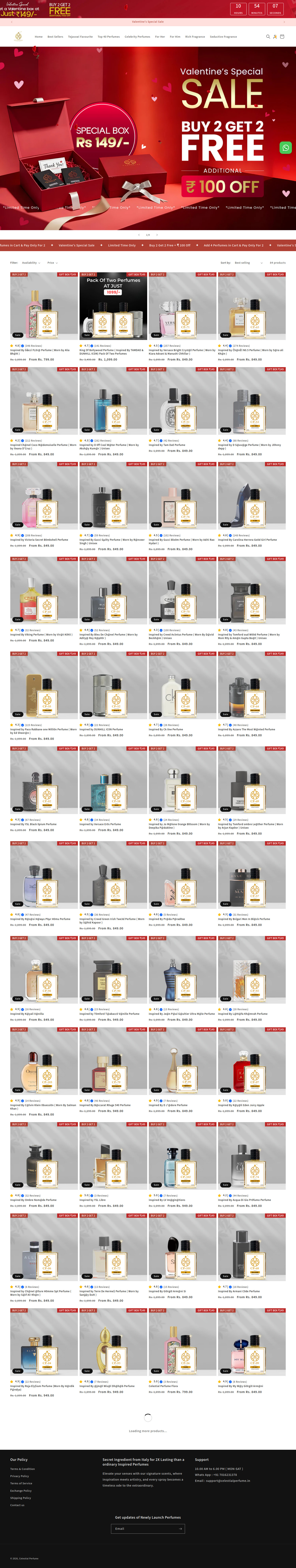
Sections Identified (4)
Announcement Bar
announcement-barA red bar at the top with text promoting a Valentine's Day sale.
Uses a bright red background for high visibility. The text is white, providing good contrast. Includes a call to action related to cart contents.
Hero Banner
heroA large red banner featuring a Valentine's Day promotion.
Features bold typography, a product image (gift box), and a clear offer: 'Buy 2 Get 2 Free'. Uses a color palette consistent with the announcement bar. A countdown timer is visible in the top right.
Product Grid
product-gridDisplays a collection of perfume products in a multi-column grid.
Each product card includes an image, title, rating, and price. 'Sale' badges are present. The layout is clean with consistent spacing between products. Includes a 'Buy 2 Get 2' badge on each product.
Footer
footerContains links to Our Policy, Secret Ingredients and Support
The footer is dark with white text.
Summary
The page design is clean and focused on product presentation, using a grid layout for easy browsing. The red color is used strategically to highlight sales and promotions, creating a sense of urgency. The design uses clear typography and consistent spacing to ensure a user-friendly experience.
Product Page
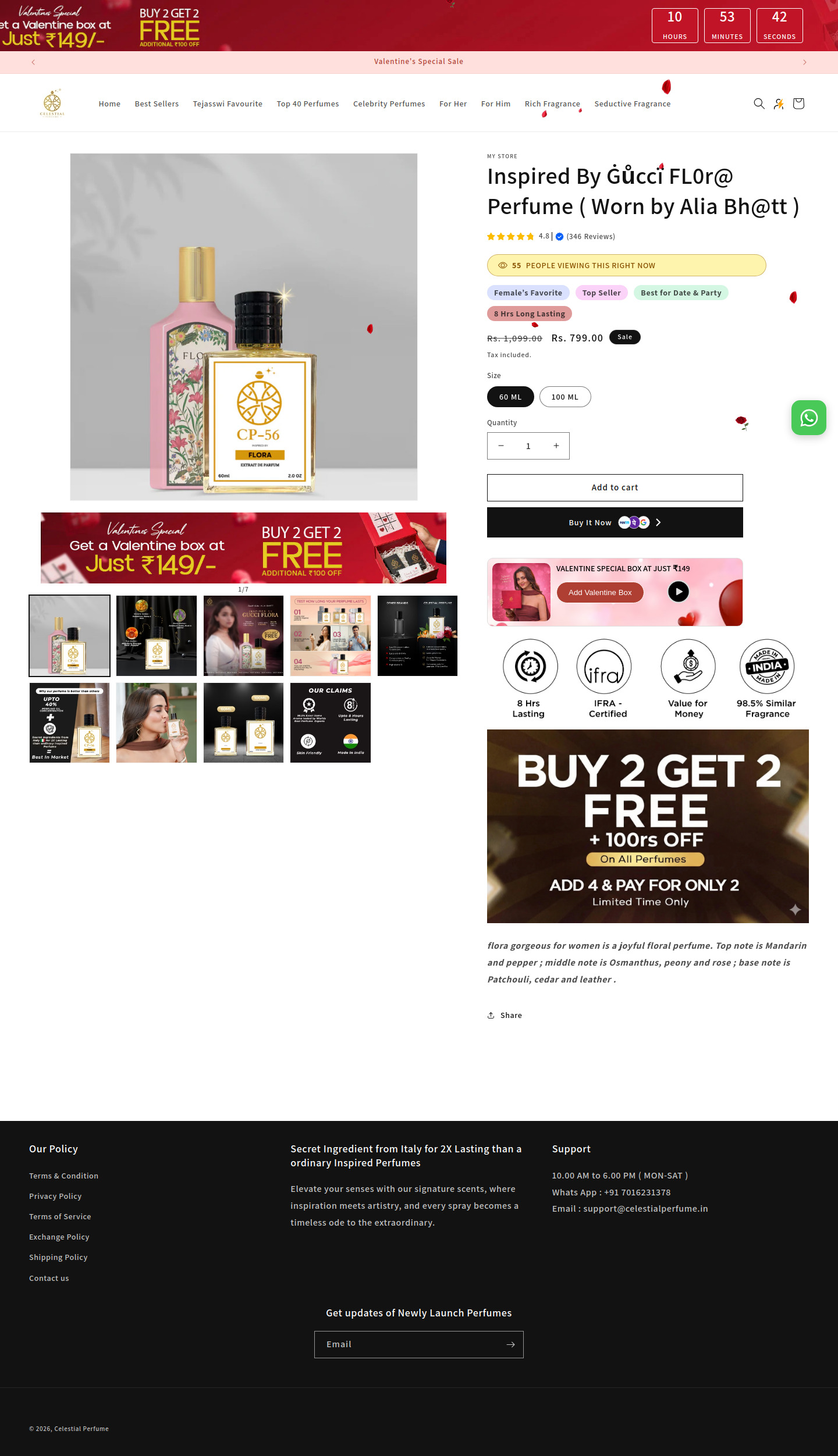
Sections Identified (11)
Announcement Bar
announcement-barThe bar at the very top advertises a Valentine's Day special promotion with a countdown timer.
Uses a contrasting red color scheme to grab attention. The countdown timer adds a sense of urgency. Uses all caps.
Navigation
navigationThe navigation menu contains links to different sections of the store, with a logo on the left and search/account icons on the right.
Clean and simple, with easy-to-read text and minimal visual clutter. The logo is small and unobtrusive.
Product Image
product-detailsThe section displays the main product image along with product details.
Large product image takes up significant space. Product details are aligned to the right. Includes product name, rating, number of reviews, and a yellow badge highlighting the number of people viewing it.
Product Pricing and Options
add-to-cartThis section shows the price of the product, available sizes, quantity selector, and 'Add to Cart' and 'Buy It Now' buttons.
Price is clearly displayed with the sale price highlighted in a larger font. Quantity selector has a simple '+' and '-' design. The 'Buy It Now' button uses a darker background for emphasis and shows payment methods.
Valentine Special Box Banner
bannerA promotional banner for a Valentine's Special box.
Uses a romantic imagery with hearts and the color red. Includes a play button possibly linking to a video.
Trust Badges
trust-badgesDisplays several badges that claim 8 Hrs Lasting, IFRA-Certified, Value for Money, and 98.5% Similar Fragrance.
The circular badges help to build credibility and trust with the customer by emphasizing quality.
Promotion Banner
bannerA banner advertising the 'Buy 2 Get 2 Free' promotion.
Uses a bold text and a dark background to grab attention. The contrasting white text against the dark background makes the banner stand out.
Product Description
product-detailsA brief text description of the product's scent notes.
Simple typography and clear language make the product description easy to understand.
Share
social-proofA 'Share' link that probably allows users to share the product on social media.
Uses a simple share icon next to the word 'Share'.
Product Image Gallery
galleryA set of smaller product images displayed in a row under the main image.
Allows the user to view the product from different angles.
Footer
footerThe footer section contains links to Our Policy, information about Secret Ingredient from Italy for 2X Lasting than a ordinary Inspired Perfumes, Support Contact details and a newsletter signup form.
Clean and simple design, with a focus on providing useful information. The newsletter signup form is located at the bottom of the page.
Summary
The product page is well-structured, focusing on clear product presentation and ease of purchase. The use of trust badges and promotional banners adds value and encourages conversions. The design is modern and minimal, ensuring a pleasant user experience.
Cart Page
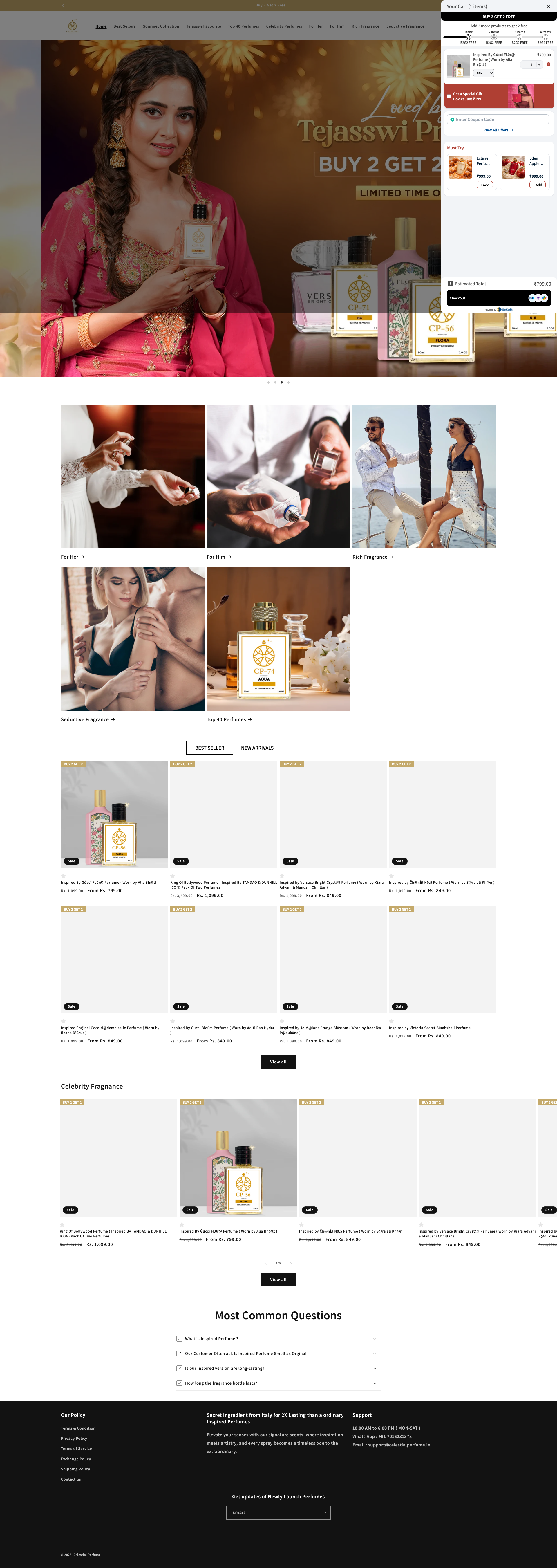
Sections Identified (2)
Cart Sidebar
add-to-cartThis is the cart sidebar that appears on the right side of the page. It displays the cart items, quantity, pricing, discounts, coupon codes, special offers, and estimated total.
Uses a clean white background with subtle gray dividers. The 'Checkout' button is a solid black CTA. The design is concise and highlights the cart's content efficiently.
Product Recommendations
related-productsDisplays related products as 'Must Try' suggestions to encourage additional purchases, includes product images, names, and add to cart buttons.
Uses small, square product images to suggest complementary items. "Add" buttons provide a simple way to increase cart value.
Summary
The cart page utilizes a minimalist design that is easy to navigate. It highlights the items in the cart, makes the checkout button very prominent, and includes elements to encourage adding more items like the 'must try' section.