fragrancecanada.ca
Design Overview
Category
Perfume & Fragrance
Country
Canada
Style
Modern
Industry
Beauty
Layout
Grid
Color Palette
This Shopify store features a product-focused design with a red and white color scheme. The layout uses grids to display a wide variety of fragrances and focuses on showcasing products with clear images and discounted prices. There is a clear emphasis on sales and a clean navigation to guide users through the store.
Homepage
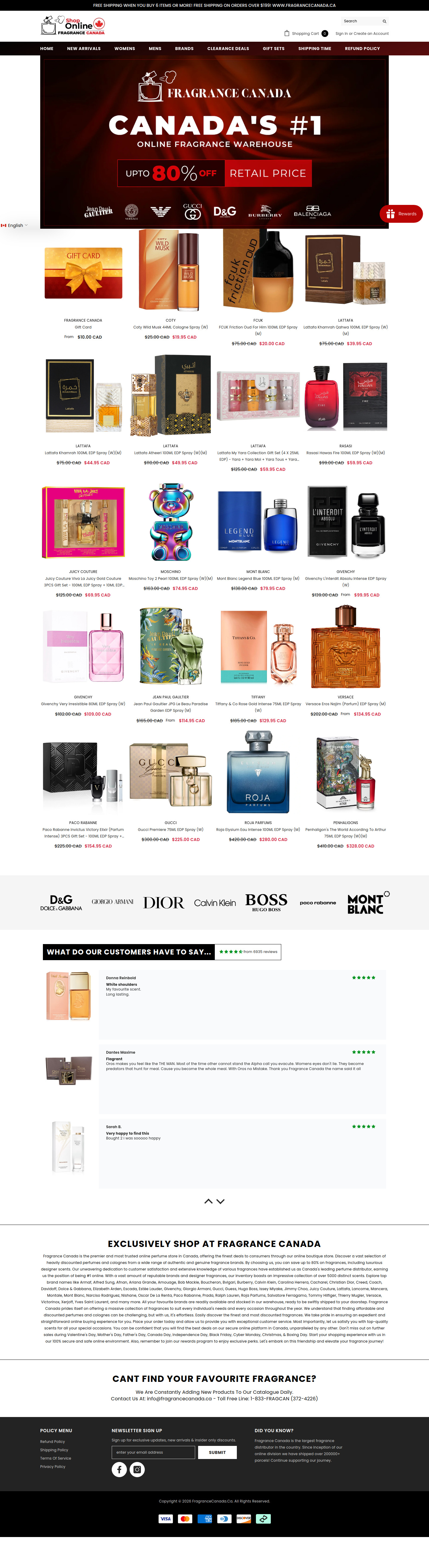
Sections Identified (8)
Announcement Bar
announcement-barA black bar at the top of the page that informs customers about free shipping promotions on orders.
Uses white text on a black background for high contrast. Bold font used to highlight the offer.
Navigation
navigationThe main navigation bar with links to different product categories, brands, and deals.
Standard horizontal navigation with centered logo. Color scheme is black, white and red. Font appears to be sans-serif.
Hero Banner
heroA large banner image promoting the brand as Canada's #1 online fragrance warehouse with a discount offer.
Uses a dark red background with white and yellow text. Features brand logos for well known designers below the main banner headline, adding to credibility.
Featured Products
featured-productsA grid display of various fragrance products, each with a product image, name, and price.
Products are displayed with images on white backgrounds. 'From' indicates potential price variations. Prices are indicated in CAD.
Brand Logos
brand-storyA row of logos from popular fragrance brands.
Black logos on a white background, evenly spaced. Placed above the customer reviews to reinforce trustworthiness.
Testimonials
testimonialsA section showcasing customer reviews with star ratings and text feedback.
Reviews use a light grey background with customer photos and star ratings. Layout uses a simple grid.
Brand Story
brand-storyA description of the brand and its mission.
Text based section with a heading that states "Exclusively shop at fragrance Canada". The copy gives information about the brand, their products and values
Footer
footerFooter section with links to policy menus, newsletter signup, and contact information.
Dark background with white text. Contains standard footer elements like policy links, newsletter signup and social media links.
Summary
The design is clean and functional, focusing on showcasing a wide range of products and deals. The use of red and white creates a sense of urgency and excitement, likely intended to drive sales. The store utilizes a grid layout effectively to present a large product catalog.
Collection Page
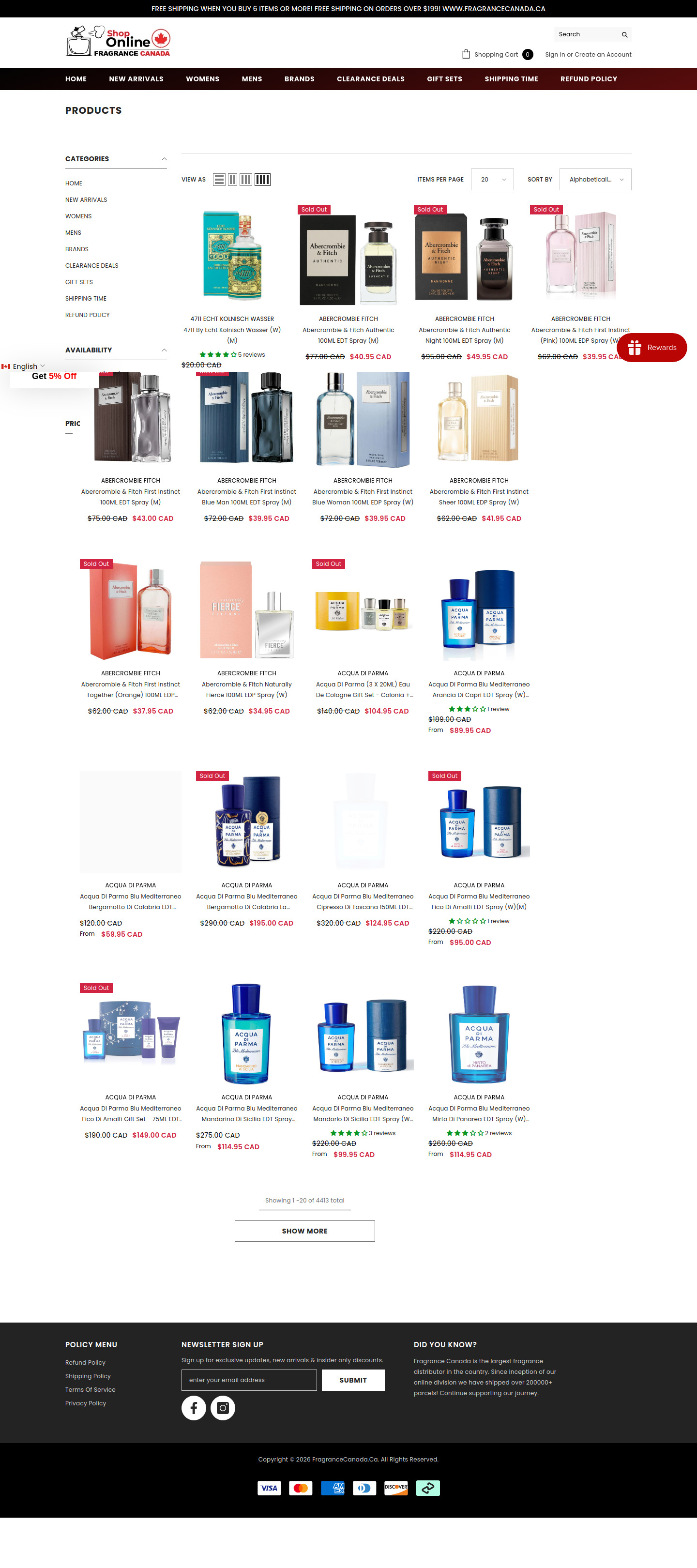
Sections Identified (3)
Categories
filtersThis section lists the various product categories available on the store as well as filter availability and price.
The Categories section is on the left. It uses a standard list format with expandable sections indicated by a small arrow. Typography is clean and easy to read. Uses a subdued grey for text on a white background.
Product Grid
product-gridThis section displays a grid of product images with product names and prices. Each product also displays a rating.
The product grid is the main content area. It uses a four-column layout for product display. Images are centered and visually consistent. Price display has a clear visual hierarchy, with sale prices highlighted in red. 'Sold Out' badges are strategically placed on relevant products. Small thumbnail icons are placed at the top left to toggle the size of the product grid.
Pagination
paginationThis section displays the current page number as well as total number of products in the collection.
Text is placed on the bottom of the product grid indicating the product range and total number of products. A 'Show More' button allows the user to view additional products.
Summary
The page design is clean and functional, prioritizing product visibility and ease of navigation. The grid layout allows users to quickly scan the available products. The use of clear pricing and sale indicators improves the shopping experience. The limited color palette helps maintain a professional look and feel.
Product Page
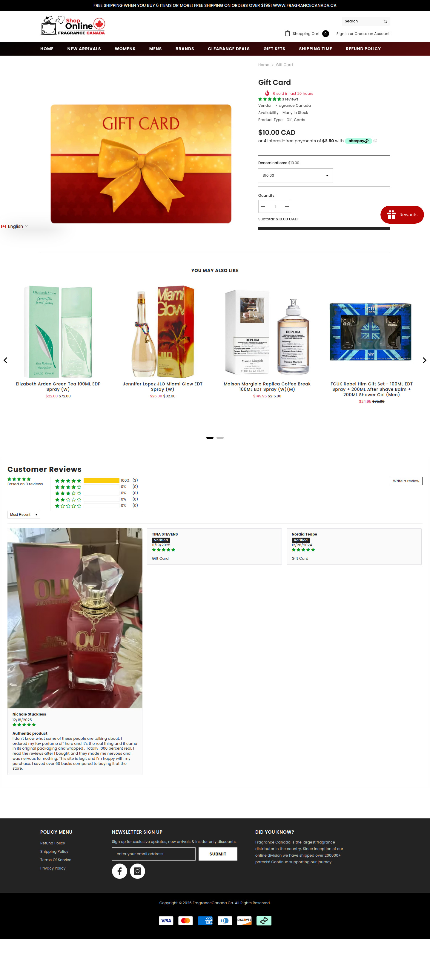
Sections Identified (4)
breadcrumbs
breadcrumbsShows the current page location within the site hierarchy. It indicates 'Home > Gift Card'.
Simple text links, using the default black color scheme.
product-details
product-detailsContains the product title, reviews, vendor, availability, price, and purchase options for the Gift Card. This section allows the user to select the denomination and quantity.
Uses a combination of bold and regular text. There is an 'afterpay' payment option badge. A red 'Rewards' button is positioned on the right. The quantity input field has simple '-' and '+' buttons.
related-products
related-productsDisplays a selection of related products under the heading 'YOU MAY ALSO LIKE'. Includes product images, names, and prices.
Products are displayed in a horizontal carousel. Prices are displayed in red. There's a small amount of spacing between items.
reviews
reviewsDisplays customer reviews with star ratings and text descriptions. Includes a summary of the overall rating distribution, individual reviews, and options to filter by most recent and write a review.
Each review card includes the reviewer's name, date, and a 'Verified' badge. Star ratings are in green. The section has a clean and organized layout.
Summary
The product page is well-structured, providing necessary information to the user. The use of white space improves readability. The 'You May Also Like' section and customer reviews encourage further engagement.
Cart Page
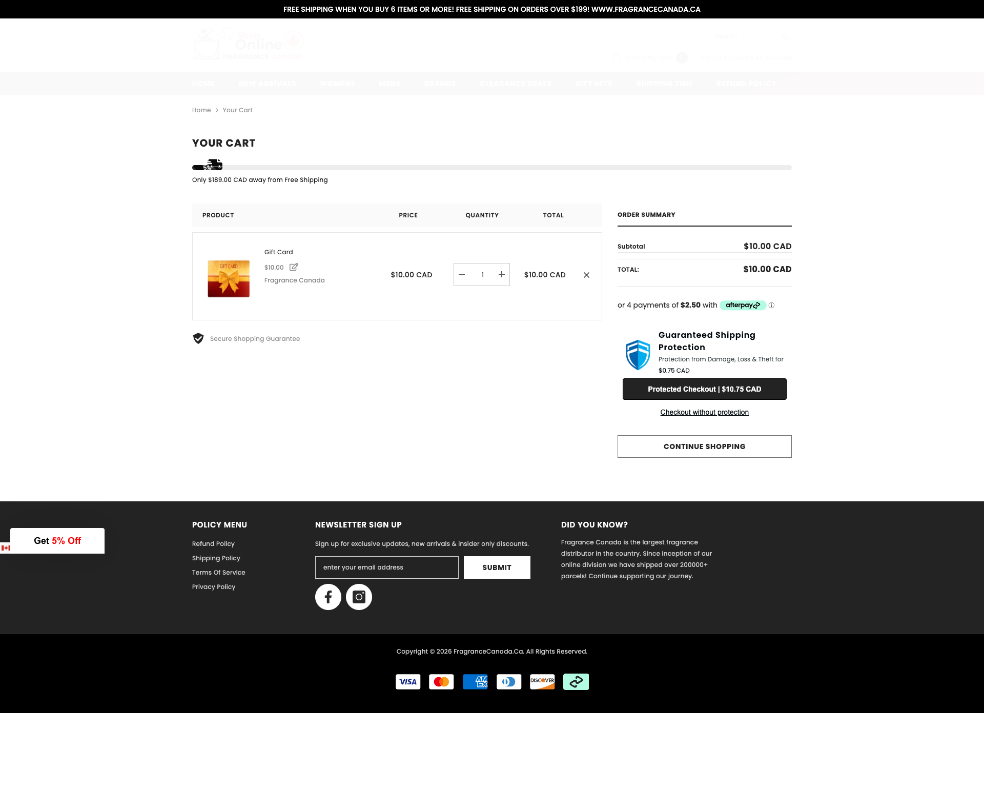
Sections Identified (8)
Breadcrumbs
breadcrumbsDisplays the current page's location in the site hierarchy: Home > Your Cart.
Simple text links with a standard 'greater than' separator. Low visual prominence.
Cart Title
aboutDisplays 'YOUR CART' in large, bold text.
Bold typography, centered above the cart contents.
Free Shipping Promotion
announcement-barInforms the user how much more they need to spend to qualify for free shipping.
Simple text statement below the cart title, indicating the remaining amount for free shipping. Uses black text on white.
Cart Items
add-to-cartLists the items in the cart, including product image, name, price, quantity controls, and total.
Structured in a tabular format with clear headings (Product, Price, Quantity, Total). Quantity controls are standard +/- buttons. A small 'x' allows the user to remove the item.
Secure Shopping Guarantee
trust-badgesA small badge stating 'Secure Shopping Guarantee'.
Simple icon next to text, placed below the cart items.
Order Summary
add-to-cartDisplays a summary of the order, including subtotal and total.
Simple table layout with clear labels. Includes the option for payment using Afterpay, as well as a guaranteed shipping protection module.
Continue Shopping
add-to-cartA link/button allowing the user to continue shopping.
Outlined button with the text 'CONTINUE SHOPPING'.
Footer
footerContains policy links, newsletter signup, company information, and copyright details.
Dark background with white text. Divided into sections for policy menu, newsletter signup, and a 'Did You Know?' factoid about the company. Includes social media icons and accepted payment methods.
Summary
The cart page employs a straightforward and functional design to guide users through the checkout process. The use of clear typography, ample whitespace, and a well-organized layout contribute to a positive user experience. The inclusion of trust badges and payment options aims to build confidence and encourage conversions.