oscardelarenta.com
Design Overview
Category
Fitness & Sportswear
Country
United States
Style
Luxury
Industry
Fashion
Layout
Single Column
Color Palette
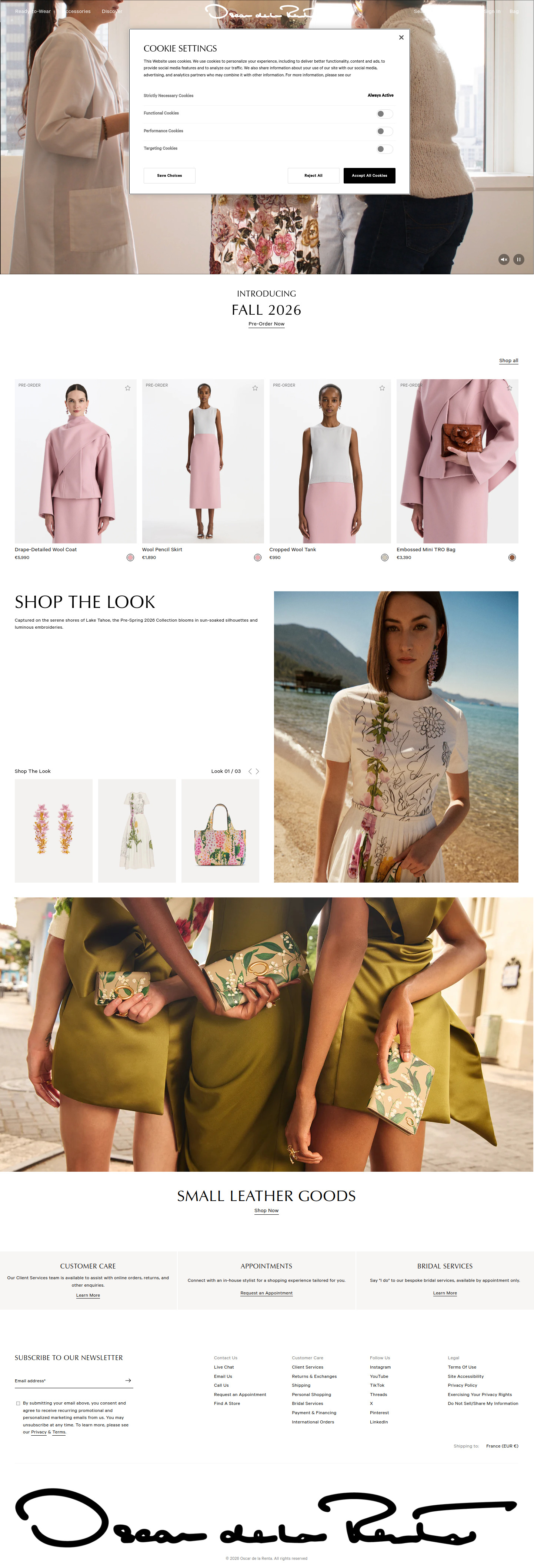
This e-commerce homepage presents a high-end, luxury aesthetic. The design employs generous whitespace, elegant typography, and high-quality product photography to convey a sense of sophistication and exclusivity, emphasizing the brand's focus on refined style.
Homepage
Sections Identified (10)
Cookie Settings
announcement-barCookie consent popup displayed on top of content
Opaque white background, minimalistic text labels
Hero Banner
heroA large image or video showcasing the brand or a specific product.
Full-width image with subtle animation controls (pause and play). Low contrast text at the top with 'Ready-to-Wear Accessories Discover' written in a serif font.
Introducing Fall 2026
bannerA text-based banner to introduce new collection.
Minimalist text centered with the words "Introducing FALL 2026" and a 'Pre-Order Now' link.
Pre-Order Products
featured-productsRow of pre-order products with product images, titles, and prices.
Four products are displayed in a horizontal row. Each has a "PRE-ORDER" label in the upper left corner. Each product has a favorite icon. Subtle color swatches underneath each product.
Shop the Look
bannerBanner highlighting a specific look or collection.
Large title 'SHOP THE LOOK' with supporting descriptive text. Serif fonts are used.
Look 01/03
product-gridA product gallery that allows users to scroll between different looks.
Images of products with a slider to switch between looks. Pagination indicator 'Look 01/03'.
Small Leather Goods
bannerA banner featuring small leather goods
Full-width image with text overlay. Link to 'Shop Now' in serif typeface.
Customer Care
aboutSection providing information about customer care, appointments and bridal services.
Three columns with brief text descriptions and 'Learn More' links.
Subscribe to Newsletter
newsletterNewsletter subscription form.
Email input field with a submit button and a checkbox for consent. Light gray background.
Footer
footerThe website footer with links to various resources and contact information.
Multiple columns with links such as Contact Us, Customer Care, Follow Us, and Legal information. The logo appears at the bottom in a signature-like style.
Summary
The page design is clean and modern, prioritizing visual appeal through high-quality photography and generous use of whitespace. The navigation is straightforward, and sections are well-defined to guide the user through the product offerings and brand story. The color palette is neutral and sophisticated, reinforcing the luxury brand image.
Collection Page
Sections Identified (5)
Announcement Bar
announcement-barTop navigation bar displaying options such as 'Ready-to-Wear', 'Accessories' and 'Discover'. It also contains the website logo and search/account functions.
Simple, clean typography and evenly spaced navigation links. Black text on a white background.
Products
product-gridA grid of product listings, each displaying a product image, name, and price. A 'contact to inquire' link is visible on the left side.
Products are displayed against a clean white backdrop. A subtle favorite/wishlist icon appears in the top right corner of each product card. A circular icon is beneath each product which may relate to product color/variation.
Pagination
paginationDisplays the current product range being viewed and provides a 'Load More' button to load the rest of the products
Simple text indicating range number and a minimalist 'Load more' button for loading the remaining product from the catalog.
Newsletter Subscription
newsletterNewsletter subscription form with email input field and terms and conditions agreement.
Simple text input with clear, readable text with a light border. The CTA is an arrow.
Footer
footerStandard footer containing links to Contact Us, Customer Care, Follow Us, and Legal information.
Simple text links organized into columns. Subdued color palette.
Summary
The collection page design is clean and minimalist, placing emphasis on the product visuals. The use of ample white space and simple typography contributes to a luxurious feel. The grid layout ensures easy navigation and a straightforward browsing experience.
Product Page
Sections Identified (9)
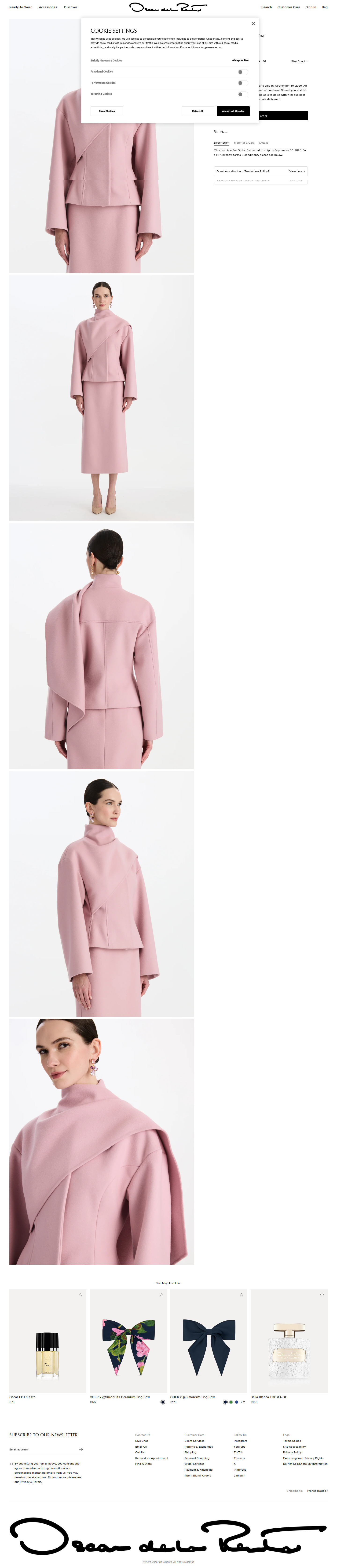
Navigation
navigationThe navigation bar contains links to different categories and general information pages like customer care, sign in, and bag.
The navigation bar is simple and text-based. The logo is placed in the center, which is a common design pattern.
Cookie Settings
announcement-barA pop up to allow users to set cookie preferences
Simple text, small toggles and two prominent call to action buttons
Product Images
galleryA series of product images showcasing the item from different angles.
Images are displayed against a stark white backdrop, highlighting the product's details and shape. The image gallery takes up a significant portion of the left side of the page.
Product Details
product-detailsContains the product name, size selection, description, and materials.
The product details are presented in a clear and concise manner. The font is simple and easy to read. The spacing between elements is generous, contributing to the overall minimalist aesthetic.
Add to Cart
add-to-cartAllows users to select quantity and add the product to their shopping cart.
The "add to order" button is prominent and uses a contrasting black color to draw attention. Size selection and quantity are also provided.
Product Description
descriptionContains the material, care, and details about the product
Simple text in light weight font.
Related Products
related-productsA section displaying similar or complementary products.
The related products are shown as square thumbnails with minimal text. A small heart icon suggests a 'save' or 'wishlist' function.
Newsletter Subscription
newsletterA form allowing users to subscribe to the newsletter.
Simple email input with a small icon for submit.
Footer
footerContains contact information, legal information, and social media links.
The footer is divided into columns with clear headings. The design is simple and consistent with the overall minimalist style.
Summary
The product page design emphasizes simplicity and elegance, allowing the product imagery to take center stage. The use of white space, clean typography, and a muted color palette create a sophisticated shopping experience. The clear layout and prominent call-to-action button facilitate easy purchasing.
Cart Page
Sections Identified (5)
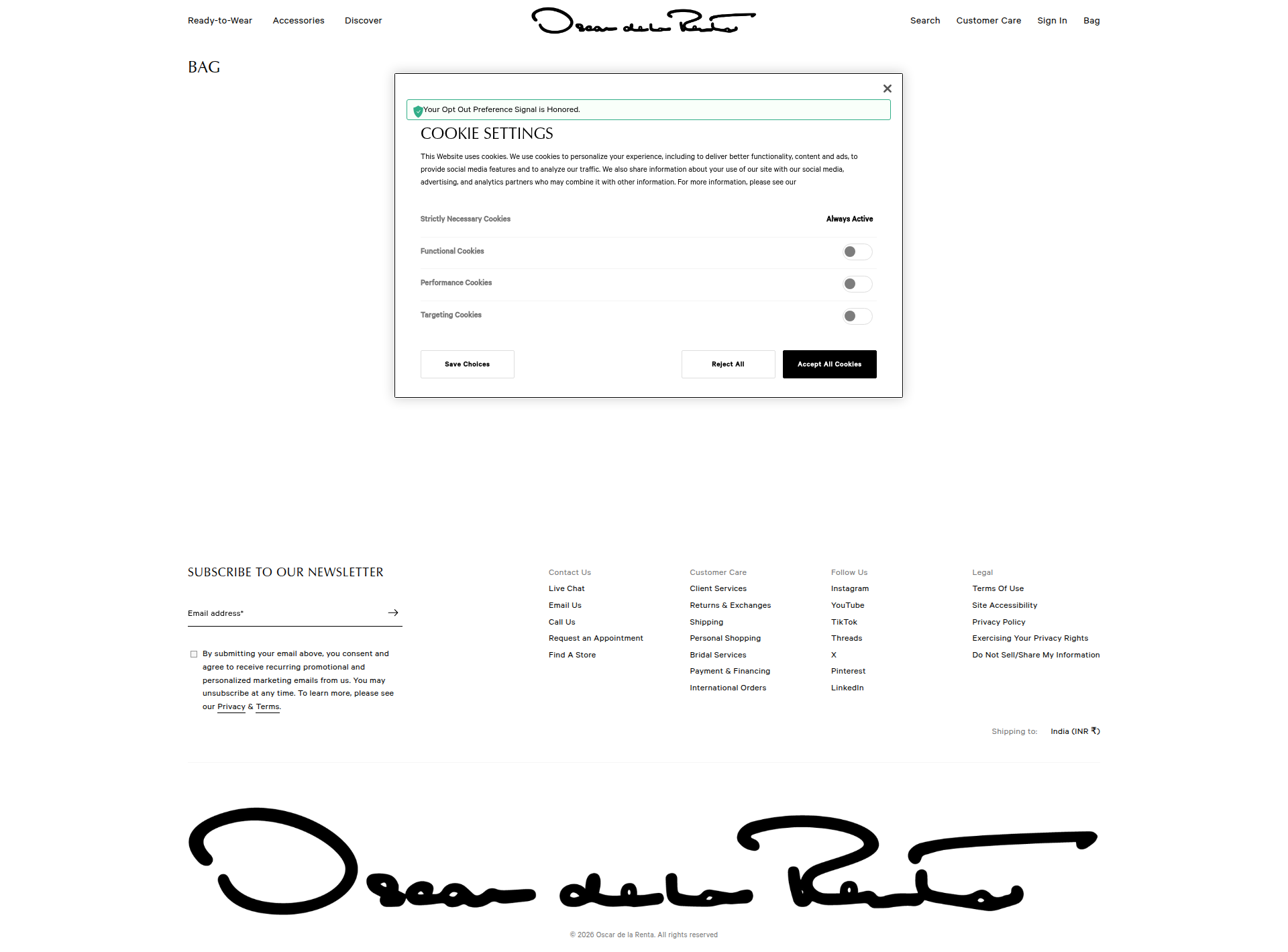
Navigation
navigationThe navigation bar includes links to different product categories, search, customer care, sign-in, and cart.
The navigation is horizontally aligned and uses a sans-serif font. The text is relatively small and spaced well for easy readability. The logo is present at the center of the header.
Page Title
heroLarge title of the page, reading 'BAG'.
Simple, prominent title indicating the page's topic. Uses a clean, bold font to attract attention.
Cookie Settings
announcement-barA modal window displaying cookie settings and options for users to configure their preferences.
The modal uses a sans-serif font for the text. It includes checkboxes and toggles for different cookie categories, with clear labeling. The CTAs include 'Save Choices', 'Reject All' and 'Accept All Cookies', with a black background for the primary CTA. There's a green indicator that your Opt Out Preference Signal is Honored.
Newsletter Subscription
newsletterA section dedicated to newsletter subscription, prompting users to enter their email address.
Uses a clean, sans-serif font. The email input field is simple with a subtle border. The arrow icon provides a visual cue. Terms and privacy link is provided below the input field.
Footer
footerThe footer contains links to Contact Us, Customer Care, Follow Us (social media), and Legal information.
The footer is divided into four columns, each containing a list of links. The text is small and in a sans-serif font. A logo is at the very bottom. There is a 'Shipping to:' location with a dropdown.
Summary
The page design is simple and minimalist, focusing on functionality and ease of use. The layout and typography contribute to a clean and luxurious aesthetic. The limited color palette and generous use of white space create a sophisticated and uncluttered look.