tallermarmo.com
Design Overview
Category
Men Apparel
Country
Italy
Style
Luxury
Industry
Fashion
Layout
Full-width
Color Palette
The website presents a sophisticated and high-end fashion brand. It utilizes full-width imagery, a minimalist design, and a predominantly dark color scheme to create a luxurious and exclusive feel. The typography is clean and modern, enhancing the overall elegance.
Homepage
Sections Identified (9)
Navigation
navigationThe top navigation bar contains links to 'Shop', 'Collections', and 'Universo' on the left and 'Assistance' and 'Account' on the right, as well as search and cart icons.
Minimalist design with clean sans-serif typography. Black background with white text provides high contrast. Icons are simple and easily recognizable.
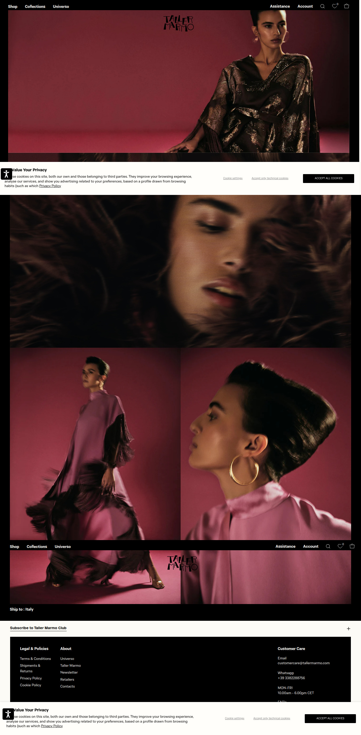
Hero Image 1
heroA full-width hero image showcasing a model wearing a luxurious garment.
The image dominates the viewport, immediately grabbing the user's attention. The color palette is rich and warm, highlighting the texture and quality of the clothing. The brand logo is subtly placed in the upper right corner.
Hero Image 2
heroA second full-width hero image featuring a close-up shot of a model.
High-quality photography with a focus on detail. The lighting and composition create a sense of intimacy and allure. Background color blends with model.
Hero Image 3
heroA third full-width hero image featuring a model wearing a garment.
Features a more dynamic pose. Background color is a soft, reddish purple. Logo is also visible.
Bottom Navigation
navigationMirrors the top navigation bar but appears at the bottom of the image section. Contains links to 'Shop', 'Collections', and 'Universo' on the left and 'Assistance' and 'Account' on the right, as well as search and cart icons.
Minimalist design with clean sans-serif typography. Black background with white text provides high contrast. Icons are simple and easily recognizable.
Footer: Ship to
shipping-infoA section to select shipping location.
Simple text link indicating the shipping location, in this case, Italy.
Footer: Subscribe
newsletterA prompt to subscribe to the Taller Marmo Club.
Text is simple and direct.
Footer: Legal & Policies / About
footerA two-column section containing links to legal policies and company information.
Organized in two columns for easy navigation. Clean typography and ample spacing.
Footer: Customer Care
footerA section with customer care information including email, whatsapp and business hours.
Provides multiple contact options.
Summary
The homepage design is centered around large, high-quality images that showcase the brand's clothing line. The minimalist navigation and predominantly dark color scheme create a sense of luxury and sophistication. The footer provides essential information and subscription options, contributing to a well-rounded user experience.
Collection Page
Sections Identified (4)
navigation
navigationThe navigation bar at the very top includes links to Shop, Collections, and Universo on the left, and Assistance and Account on the right. There are also icons for search, favorites and shopping cart.
The navigation uses a simple sans-serif typeface. There is a subtle contrast between the white text and the dark background. The spacing is clean and balanced.
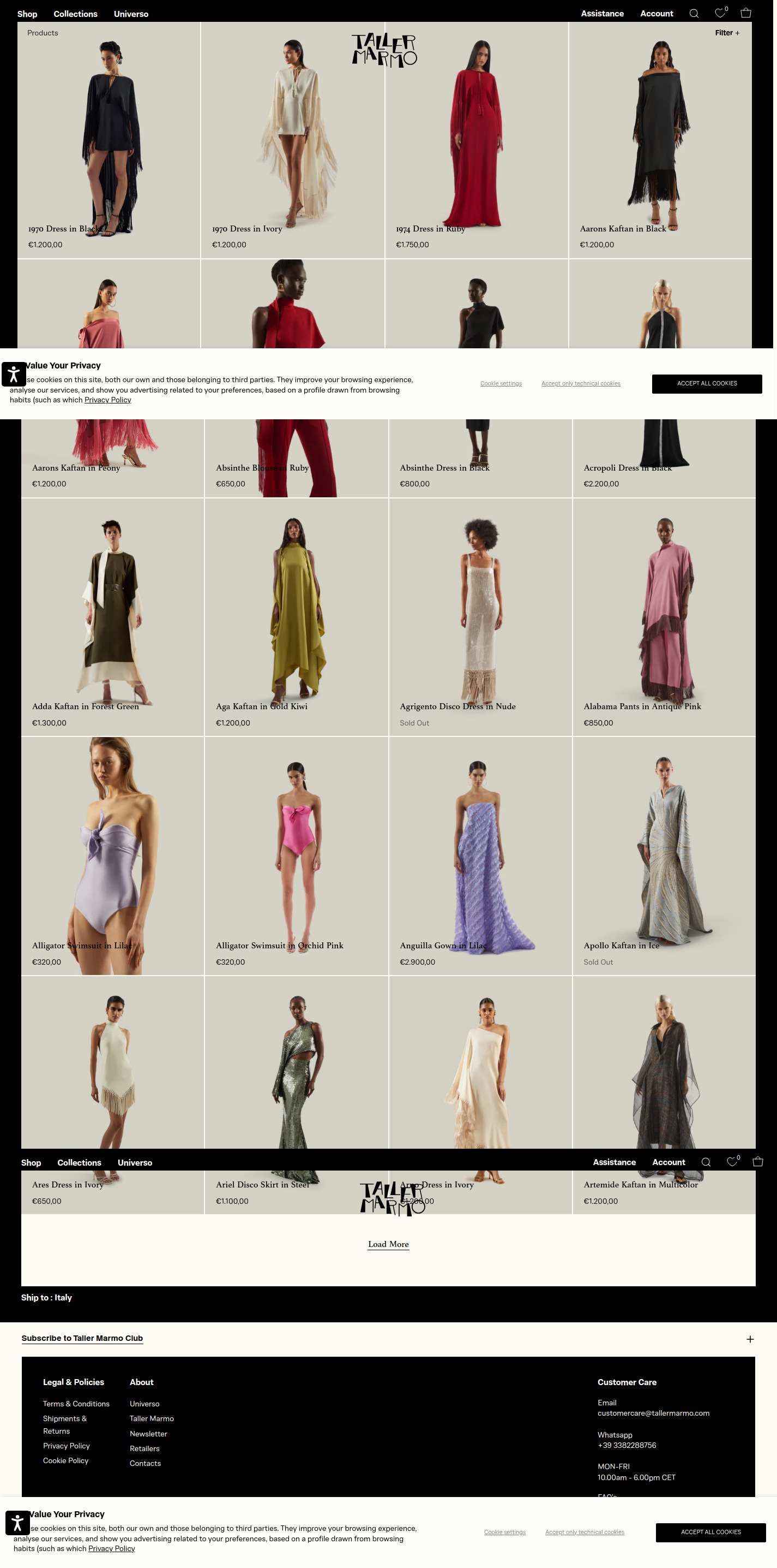
product-grid
product-gridThis section displays a grid of products, each with a product image, name, and price.
The product images are large and high-quality, showcasing the details of the clothing. The product titles are in a simple sans-serif font, and the prices are displayed below. The grid layout is clean and evenly spaced.
load-more
paginationButton to load more products into the grid.
The 'Load More' button uses a simple sans-serif font.
footer
footerThe footer contains links to Legal & Policies, About information, and Customer Care details.
The footer is a solid black background with white text. It is divided into columns, providing easy access to important information. A small '+' sign can expand the footer with further details.
Summary
The collection page features a grid layout highlighting high-quality product images. The design is minimalist and elegant, utilizing a black and white color palette and clean typography to create a luxury aesthetic.
Product Page
Sections Identified (7)
Navigation
navigationThe top navigation bar includes links for 'Shop', 'Collections', 'Universo', 'Assistance', and 'Account', along with icons for wishlist and cart. Its purpose is to allow users to easily navigate the website.
The navigation has minimal styling, with simple sans-serif typography and black text on a light background. Spacing is even and clean.
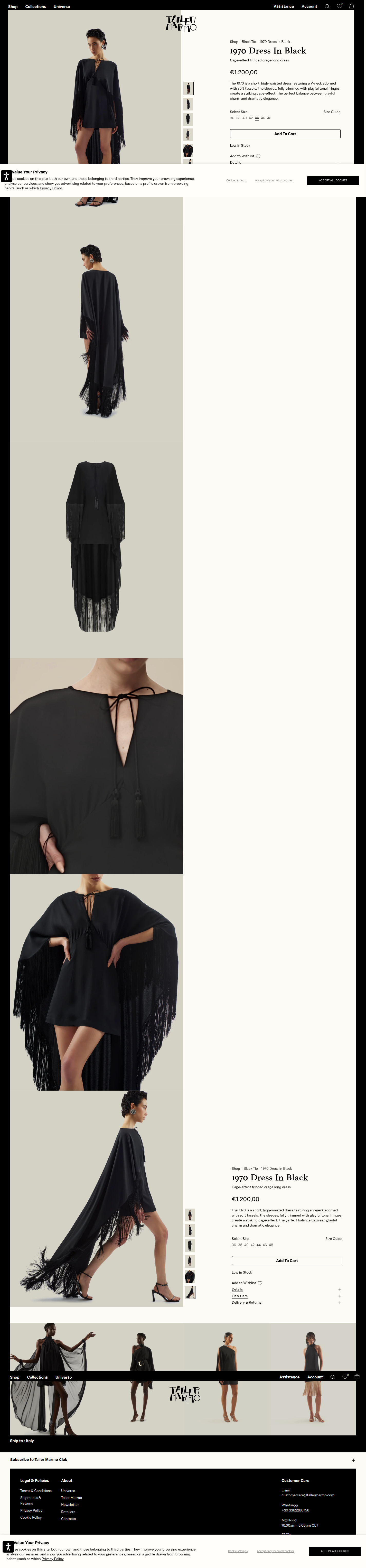
Product Images
galleryThis section contains a carousel of product images, allowing users to view the item from multiple angles and perspectives.
The images are large and high-quality, set against a light background. A vertical slider allows for scrolling through the product images. There is a notable contrast between the product (black dress) and the light background which draws the eye.
Product Details
product-detailsThis section provides information about the product, including its name, price, description, and available sizes.
The title is prominently displayed, followed by the price and a concise description. The font is a simple sans-serif. There's a size selection area and details regarding the dress' design. The spacing is generous to give the page breathing room.
Add to Cart
add-to-cartIncludes size selection, quantity, and a button that lets customers add the product to their cart.
The 'Add to Cart' button is a simple black rectangle with white text. Size selection is presented as a series of clickable options. The section also includes a link to add the item to a wishlist.
Additional Details
shipping-infoThis section includes information on details, fit & care, and delivery & returns.
The layout is simple, and details are accessible by expanding accordions when selecting the '+' button.
Related Products
related-productsA carousel or grid displaying similar or complementary products to encourage further purchases.
The product images are displayed above the product name. These images show models wearing the clothes, and the images are small.
Footer
footerThe footer contains links to legal information, company information, customer care and subscription options.
The footer is in a black background with white text. It is divided into columns for easy navigation. There is a section to sign up for the Taller Marmo Club.
Summary
The page uses a clean and modern design, emphasizing high-quality product photography and clear product information. The split layout effectively separates visuals from details, creating a balanced user experience. The minimalist color palette and simple typography contribute to the overall luxurious aesthetic.
Cart Page
Sections Identified (4)
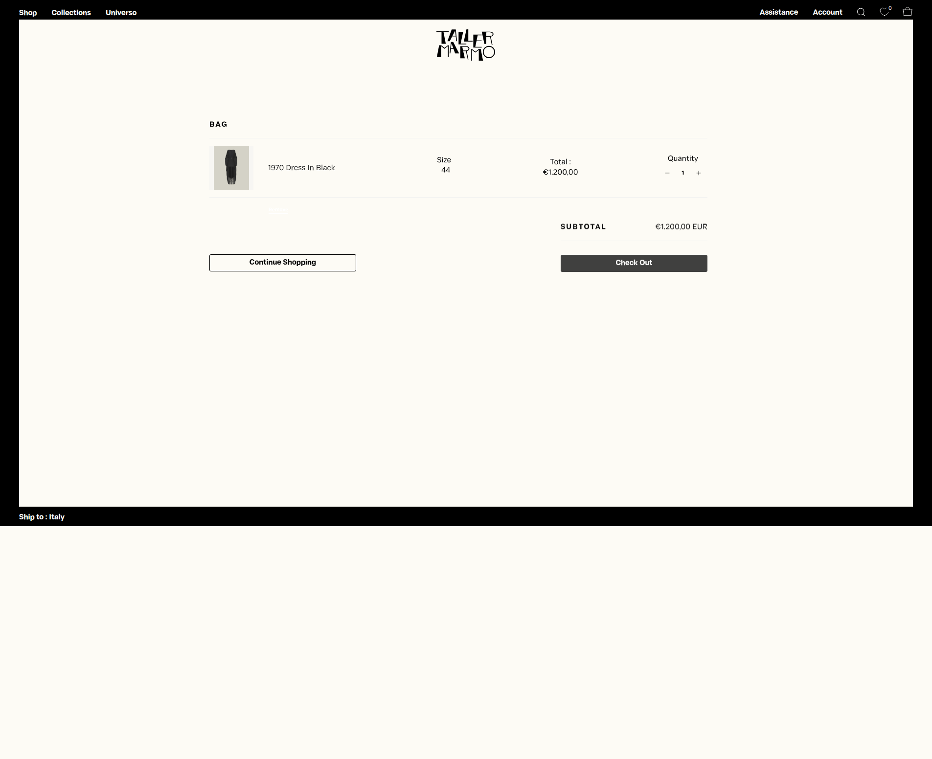
Cart Summary
add-to-cartThis section displays the items in the cart, including product image, name, selected size, quantity, and total price. It allows the user to adjust the quantity of each item.
Product images are small and presented with sufficient spacing. Quantity adjustment uses a simple '+' and '-' button. The text is primarily in black, with a clean and readable font.
Continue Shopping Button
bannerA button that allows the user to navigate back to the product listing and continue shopping.
The button is a simple outlined rectangle with the text 'Continue Shopping' in black. The design is understated, allowing the checkout button to take prominence.
Subtotal
shipping-infoShows the subtotal amount of the current cart, before shipping and taxes.
Displays the subtotal in a clear and concise manner, with currency information.
Checkout
add-to-cartContains subtotal price and a prominent button to proceed to the checkout page.
The 'Check Out' button is a solid dark gray rectangle, providing a clear call to action. It is visually distinct from the 'Continue Shopping' button, guiding the user towards completing the purchase.
Summary
The cart page is designed for a smooth and efficient checkout process. Its minimal aesthetic creates a luxurious feel, while the clear layout and prominent 'Check Out' button encourage conversions. The design prioritizes essential information and eliminates distractions.