cl.loccitane.com
Design Overview
Category
Perfume & Fragrance
Country
Spain
Style
Modern
Industry
Beauty
Layout
Single Column
Color Palette
The website features a clean and modern design with a focus on product imagery. It uses a light color palette with gold accents to create a luxurious and inviting feel. The layout is straightforward, prioritizing visual merchandising and clear navigation.
Homepage
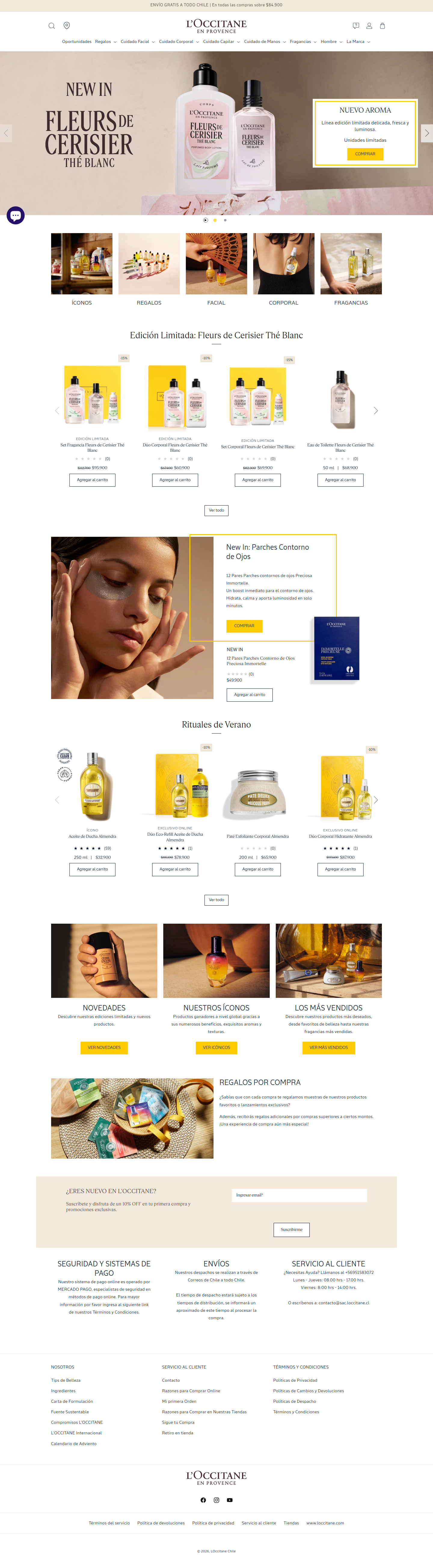
Sections Identified (13)
Announcement Bar
announcement-barA top bar that announces free shipping within Chile for orders over $84,900.
Simple, one-line text with good contrast against the background. Minimalist design.
Navigation
navigationStandard navigation menu with the brand logo centered, search icon and account links on the left and right. Menu items include product categories.
Clean and minimal with good spacing. The logo is prominent but not overwhelming.
Hero Banner
heroA carousel showcasing the 'Fleurs de Cerisier Thé Blanc' collection and a new aroma. It features high-quality product and lifestyle imagery.
Carousel with left and right arrows. Clear text overlay with product name. A secondary section is a gold outlined box with the description of another collection. The CTA is a gold button.
Category Highlights
collection-listA section showcasing different product categories like 'Íconos', 'Regalos', 'Facial', 'Corporal', and 'Fragancias'. Each category is represented with an image.
Horizontal scrolling gallery of product categories. Simple text labels below each image.
Limited Edition: Fleurs de Cerisier Thé Blanc
featured-productsHighlights products from the 'Fleurs de Cerisier Thé Blanc' limited edition collection.
Product cards with images, name, rating, price, and an 'Agregar al carrito' (Add to Cart) button. Products are displayed in a horizontal scrolling carousel. "Ver todo" (See all) is listed under the items. The product images have a distinct yellow background for the collection items.
New In: Parches Contorno de Ojos
featured-productsShows a 'New In' item: eye patches. Contains product name, description, price and call-to-action.
Product displayed with an image of a model wearing the eye patches, and a second image of the product package. Highlighted with a yellow outlined box similar to the hero section.
Rituales de Verano
featured-productsFeatures products from the 'Rituales de Verano' (Summer Rituals) collection.
Uses the same product card style as the 'Fleurs de Cerisier Thé Blanc' section. Horizontal scrolling carousel. "Ver todo" (See all) is listed under the items.
Novedades, Nuestros Íconos, Los Más Vendidos
featured-productsHighlights new arrivals, iconic products, and best-selling items.
Each section displays an image and a brief description with a call-to-action button. The layout is a three-column grid. Gold CTA buttons.
Regalos por Compra
bannerPromotes purchase gifts and exclusive samples.
Features an image with a brief description and promotional text.
Newsletter Signup
newsletterA section where users can subscribe to the newsletter and receive a 10% discount on their first purchase.
Email input field and a 'Suscribirme' (Subscribe) button on a light background.
Security, Shipping, Customer Service
shipping-infoProvides information about payment security, shipping, and customer service.
Three-column layout with brief text descriptions.
Footer Navigation
footerLinks to various pages such as 'Nosotros' (About Us), 'Servicio al Cliente' (Customer Service), and 'Términos y Condiciones' (Terms and Conditions).
Multi-column list of links. Standard footer navigation.
Brand Information and Social Media
footerIncludes the brand logo, social media links, and copyright information.
Bottom section of the footer with brand logo, social media icons, and copyright notice.
Summary
The home page is well-structured and visually appealing, using a clean layout and consistent design elements. The use of high-quality product images and strategic placement of call-to-action buttons helps drive conversions. The overall design reflects a luxury and sophisticated brand image.
Collection Page
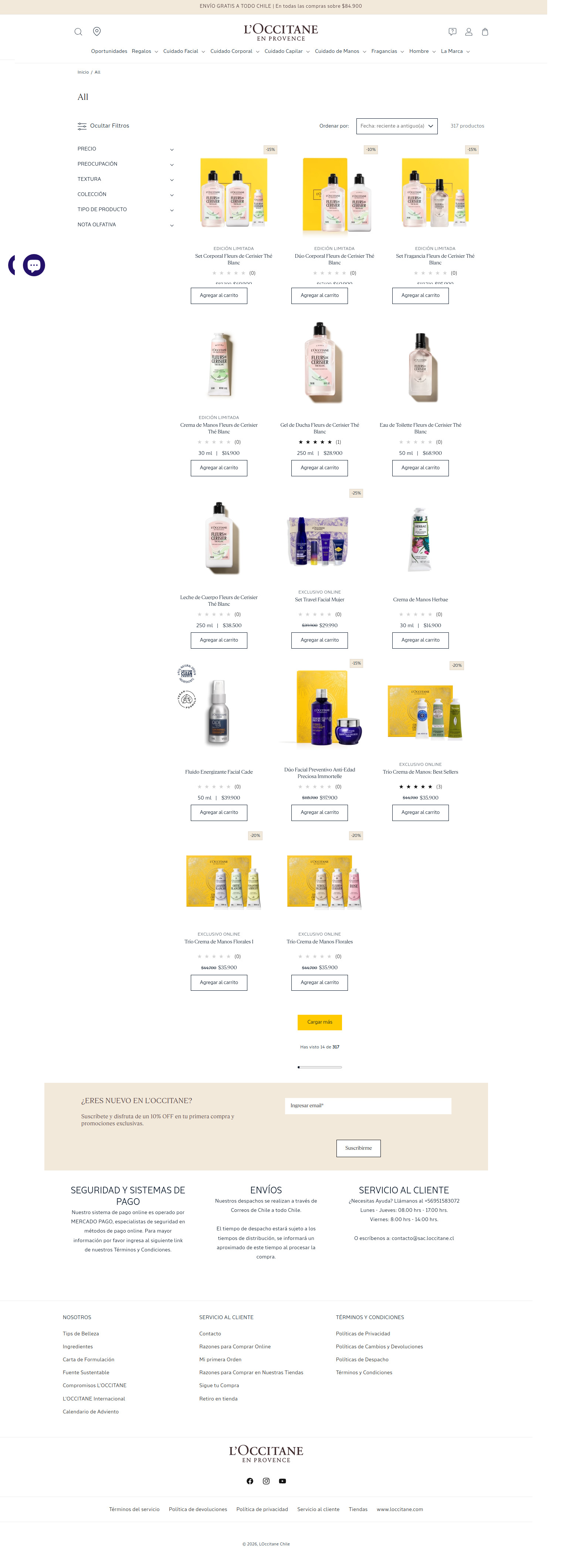
Sections Identified (11)
Announcement Bar
announcement-barA banner at the very top of the page, displaying the message "ENVÍO GRATIS A TODO CHILE | En todas las compras sobre $84.900" (Free shipping to Chile for orders over $84,900).
The banner is plain and uses a simple, readable font. The color is not visible, but based on the rest of the design, it's likely a neutral or brand color.
Navigation
navigationThe main navigation bar, including the brand logo, search bar, account and cart icons, and links to various product categories.
The navigation is clean and minimal, using a simple sans-serif font. The logo is prominent and centered. Icons are used for account and cart access.
Breadcrumbs
breadcrumbsDisplays the current page's location within the site's hierarchy, showing "Inicio / All".
Simple text, standard breadcrumb style.
Collection Title
bannerDisplays the title of the collection, in this case 'All'.
Simple text, likely a larger font size than the other text on the page.
Filters and Sorting
filtersSection for filtering and sorting the products. Includes options such as "Precio" (Price), "Preocupación" (Concern), "Textura" (Texture), "Colección" (Collection), "Tipo de Producto" (Product Type), and "Nota Olfativa" (Olfactory Note). Also contains sorting options such as "Fecha: reciente a antiguo(a)" (Date: Recent to Oldest).
The filters are displayed in a collapsible accordion style. The sorting options are contained in a dropdown menu. Simple, clean design.
Product Grid
product-gridDisplays the products in a grid layout. Each product card includes an image, name, price, rating (stars), and an "Agregar al carrito" (Add to cart) button.
The product images are the focal point of each card. The product name and price are displayed below the image, followed by a star rating and the add to cart button. Some products have a -15% or -10% badge indicating a discount. The "Agregar al carrito" button is in a simple, outlined style. The background of each card is white, ensuring visual consistency.
Load More Button
paginationA button labeled "Cargar más" (Load more) that loads more products into the product grid.
The button appears to be a solid yellow color. Below the button, there's a progress indicator showing how many products have been viewed out of the total.
Newsletter Signup
newsletterA section to encourage users to subscribe to the newsletter, offering a 10% discount on their first purchase.
This section has a light beige background, setting it apart from the white product grid. There's an input field for the email address and a "Suscribirme" (Subscribe) button.
Footer - Payment Security, Shipping, Customer Service
footerThe footer is divided into sections for payment security information, shipping information, and customer service contact details.
Simple text and layout, likely in a small font size.
Footer - About Us, Customer Service, Terms & Conditions
footerThe footer contains links to "Nosotros" (About Us), "Servicio al Cliente" (Customer Service) and "Términos y Condiciones" (Terms and Conditions).
Simple text and layout, likely in a small font size.
Footer - Brand Logo and Copyright
footerThe footer includes the brand logo and copyright information.
Simple text and logo placement.
Summary
The collection page design is clean and minimal, prioritizing product images and a straightforward shopping experience. The consistent use of white backgrounds and simple typography contributes to a sense of sophistication. The filter and sorting options are clearly presented, and the 'Add to Cart' buttons are prominent, aiding in quick product selection.
Product Page
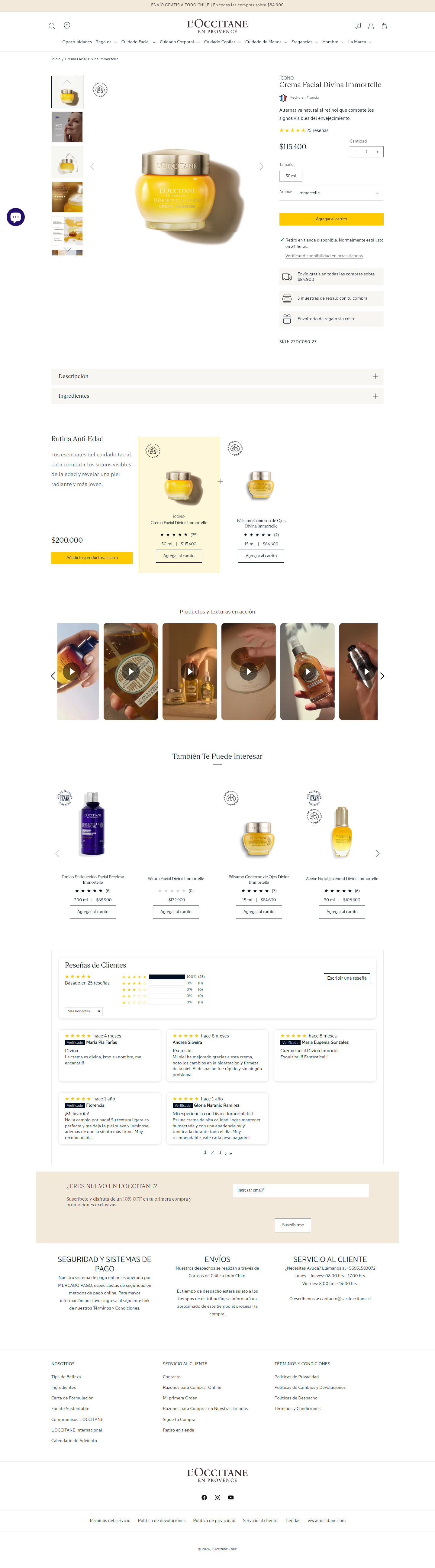
Sections Identified (9)
Navigation
navigationThe navigation bar contains links to different categories, account and cart icons, and the brand logo, facilitating easy site navigation.
Minimalist design with small icons and a clean typeface. The logo is placed centrally, indicating brand importance.
Product Details
product-detailsThis section displays the product image, title, customer ratings, price, size options, and add-to-cart functionality.
The product image is large and prominent. Clear pricing and easy-to-access reviews build trust. The add to cart button uses a bright color to grab attention.
Product Description Accordion
product-detailsAn accordion section that holds product description and ingredients.
Uses a minimal approach with simple + symbols as the accordion trigger. Subdued background color.
Routine Builder
related-productsPromotional section with related products to enhance a customer's routine.
Uses a muted background color with product cards displayed with clear product images, star ratings, and add to cart buttons to encourage purchase.
Product Texture Videos
videoA carousel of videos demonstrating the product textures in action.
The design uses thumbnail images to showcase the videos, each with a play icon overlaid. The carousel allows for a quick scroll through multiple product demos.
You May Also Like
related-productsA section displaying products customers may also be interested in.
Similar to the 'Routine Builder' with a focus on product images, names, star ratings and an 'agregar al carrito' button. Some products shown have a 'sale' badge overlay.
Customer Reviews
reviewsSection displaying customer reviews for the product with ratings and comments.
The section shows an overview of the star rating distribution, followed by individual customer reviews with verification badges. A button enables customers to write a review. Simple layout, uses stars to rate.
Newsletter Subscription
newsletterA newsletter signup form.
Light background color to differentiate it from the review section. Clear call to action to subscribe and receive a discount.
Footer
footerThe footer includes links to important information such as customer service, company information, and terms and conditions.
Organized into multiple columns with minimal styling. Includes the brand logo and social media icons.
Summary
The product page design is clean and modern, prioritizing product visuals and essential information. The layout utilizes a split-screen approach to showcase the product and provide detailed specifications. The design also integrates user reviews and related product suggestions to enhance the shopping experience.
Cart Page
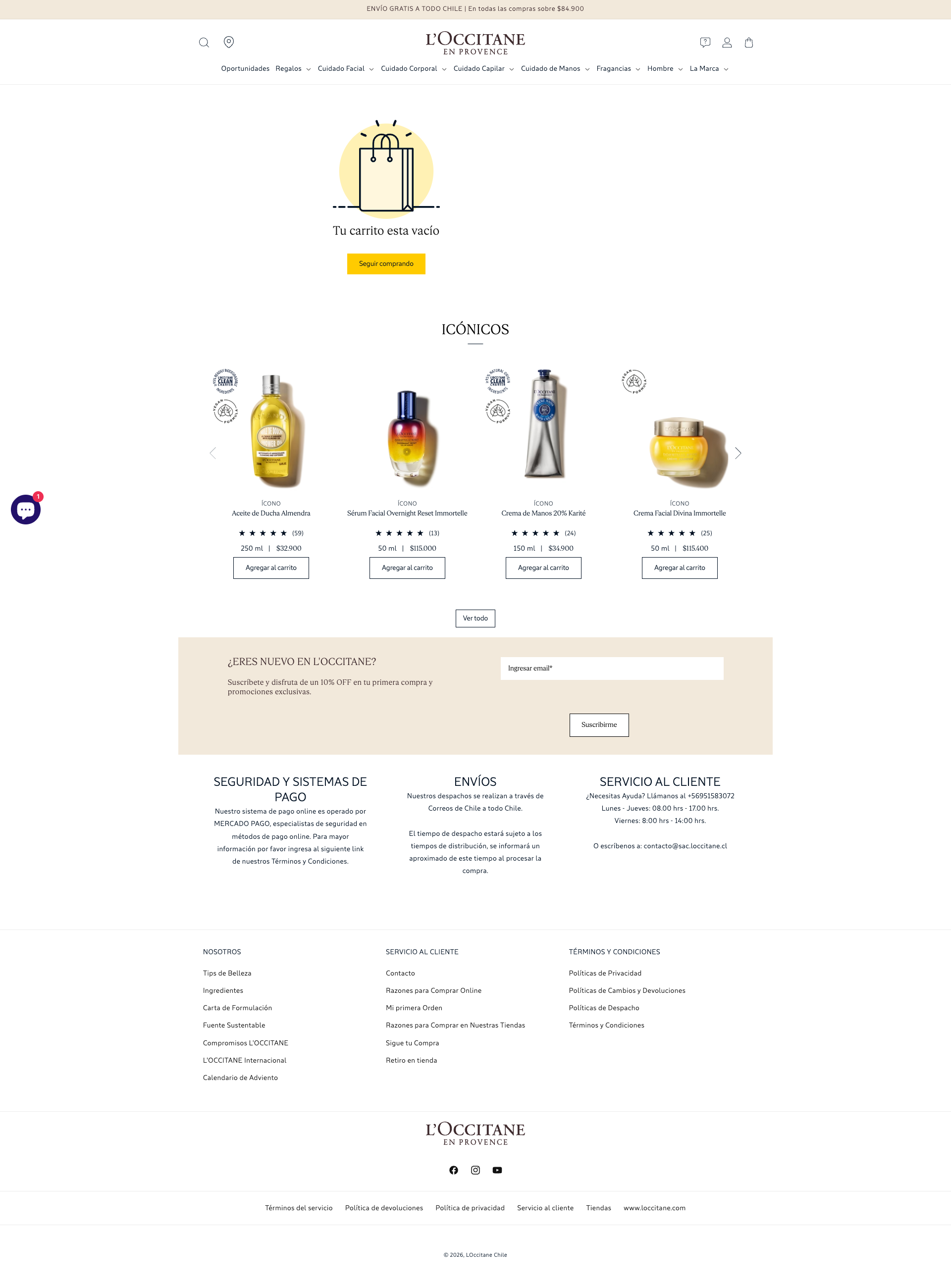
Sections Identified (11)
Empty Cart Message
heroThis section displays a message indicating that the cart is empty, accompanied by a shopping bag graphic. It prompts the user to continue shopping.
The message 'Tu carrito esta vacío' is in a larger font size. The shopping bag icon is a simple line drawing. The 'Seguir comprando' button is a bright yellow (#F0AD4E), providing a strong call to action.
Iconic Products
featured-productsThis section showcases a selection of iconic products from the brand. It features product images, names, ratings, sizes, prices, and 'Agregar al carrito' buttons.
The product images are clean and well-lit. Each product card includes a small icon in the upper left corner, likely signifying product benefits (e.g., vegan). Product names are in a clear, readable font. The ratings are displayed using star icons. 'Agregar al carrito' buttons use a simple border and text styling. The section utilizes a horizontal scrolling carousel design.
Newsletter Signup
newsletterThis section invites new customers to subscribe to the L'Occitane newsletter for a discount on their first purchase.
The background color is a light beige (#F2E8D9). The title uses a larger font. A simple text field for the email address and a 'Suscribirme' button are provided.
Security and Payment Information
trust-badgesProvides information regarding the security of payment methods and systems.
The text is in a smaller font, and there are no actual visual badges here. It communicates trust and safety in a textual manner.
Shipping Information
shipping-infoOffers details about shipping methods and delivery times within Chile.
Similar to the payment information section, this relies on text to convey the shipping process to customers.
Customer Service
aboutLists ways to contact customer service including a phone number, operating hours, and email.
Basic text formatting provides the necessary details for customer support. The design is simple and direct.
Footer Links 1
footerThe first column of footer links, under the 'Nosotros' title, providing navigation to pages like 'Tips de Belleza' and 'Calendario de Adviento'.
Uses simple, clean typography. A single column format is used.
Footer Links 2
footerThe second column of footer links, under the 'Servicio al Cliente' title, providing navigation to pages like 'Contacto' and 'Retiro en tienda'.
Uses simple, clean typography. A single column format is used.
Footer Links 3
footerThe third column of footer links, under the 'Términos y Condiciones' title, providing navigation to legal pages.
Uses simple, clean typography. A single column format is used.
Footer Logo and Socials
footerThe L'Occitane logo and social media links.
The logo is centered, and the social media icons are in black and white.
Footer Legal
footerLegal links and copyright information.
The text is very small, and links are separated by vertical bars. The copyright information indicates 2026.
Summary
The cart page utilizes a minimalist design, emphasizing clarity and ease of use. The 'empty cart' message is prominent, and the suggested products are displayed in an appealing manner. The design promotes brand trust through clear payment and shipping information, and the footer offers easy navigation to important links.