michaelstars.com
Design Overview
Category
Women Fashion
Country
United States
Style
Minimal
Industry
Fashion
Layout
Single Column
Color Palette
The website features a clean and minimal design with a focus on lifestyle photography. The color palette is primarily neutral, allowing the clothing to stand out. The overall impression is one of relaxed sophistication and effortless style.
Homepage
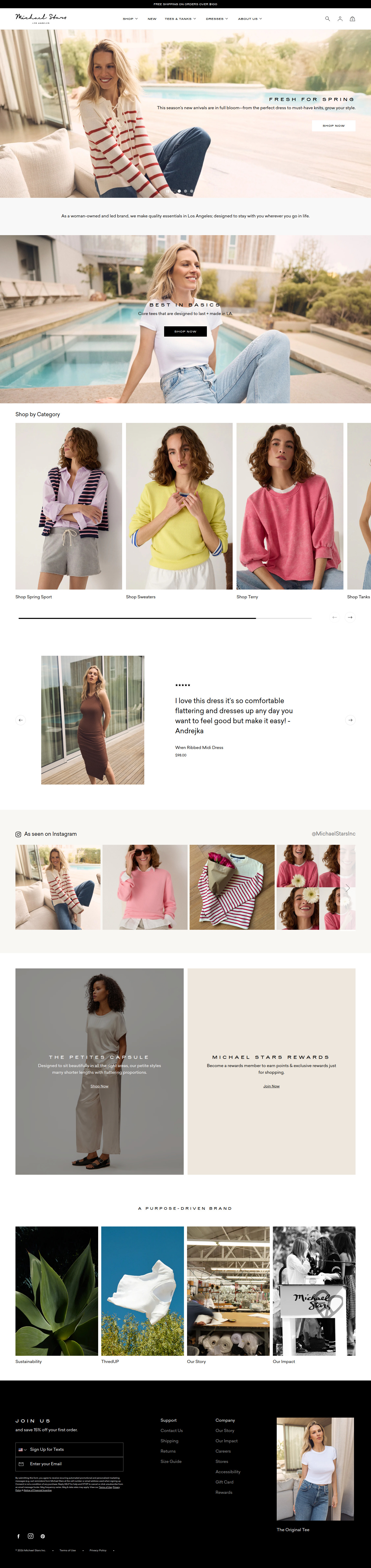
Sections Identified (10)
Navigation
navigationThe navigation bar contains the logo on the left and menu items such as Shop, New, Tees & Tanks, Dressed, About Us, Search Icon, Account Icon, and Cart Icon
Clean font, small icons, minimal spacing. Appears to be a standard sticky header.
Hero Banner 1
heroA large lifestyle image featuring a model wearing clothing from the brand. Includes a headline and short description.
Warm lighting in the image, overlayed text with plenty of white space. Button CTA 'Shop Now' is white with a black outline.
Hero Banner 2
heroA large lifestyle image featuring a model wearing clothing from the brand. Includes a headline and short description.
Cool lighting in the image, overlayed text with plenty of white space. Button CTA 'Shop Now' is black.
Shop By Category
collection-listA section displaying different product categories with associated imagery and links to the respective category pages.
Grid layout, images of models wearing relevant clothing, category names as text links below each image.
Customer Review
reviewsFeatures a customer review for a product with a star rating, review text, customer name and product details with price.
Clean layout, small star icons, clear typography for the review text.
Instagram Feed
galleryA section displaying images from the brand's Instagram feed.
Horizontal scrolling gallery, square images, Instagram logo and brand username included.
The Petites Capsule
bannerA banner ad for the petites clothing line, featuring an image and brief description.
Neutral color background, clear typography, subtle CTA button.
Michael Stars Rewards
bannerA banner ad for the rewards program, including a brief description and a call to action.
Neutral color background, clear typography, subtle CTA button.
A Purpose-Driven Brand
brand-storyA section showcasing the brand's values and story through images and links.
Consists of product and brand images.
Footer
footerThe footer contains links to support, company information, and a newsletter signup form.
Black background, white text, standard footer layout.
Summary
The design is clean and professional, with a focus on showcasing the clothing through high-quality lifestyle imagery. The neutral color palette and minimal design elements contribute to a sophisticated and effortless aesthetic, while promoting a user-friendly shopping experience. The use of customer reviews and social media integration adds credibility and social proof.
Collection Page

Sections Identified (1)
Product Grid
product-gridThis section likely displays a collection of products arranged in a grid format.
The grid layout suggests a clean and organized presentation. Details about product cards, image sizes, and spacing are unavailable.
Summary
The page appears to utilize a straightforward grid-based layout for product display, emphasizing simplicity and ease of navigation. The design's lack of distinct features makes it difficult to assess its strengths comprehensively.
Product Page
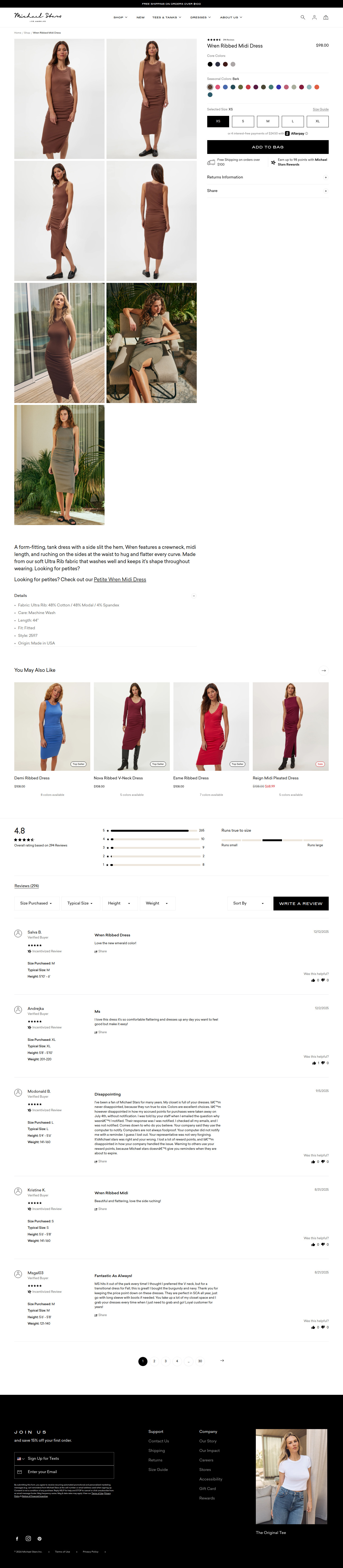
Sections Identified (7)
Product Images
galleryDisplays multiple images of the product from different angles and in various settings.
Images are well-lit and professionally shot. Consistent background lighting helps maintain a clean, cohesive aesthetic. Images are arranged in a grid pattern to showcase different views of the product.
Product Details
product-detailsDisplays the product title, price, color options, size selection, and Add to Bag button.
Title uses a clean, sans-serif font. Color swatches are small circles representing the available options. Size selection uses rectangular buttons with clearly labeled sizes. 'Add to Bag' button is a solid black rectangular shape, which stands out. Price is displayed prominently.
Product Purchase Options
add-to-cartAllows customers to select size, color and add the item to their cart. It also displays payment options, shipping information, returns information and a share button.
Size selection buttons are simple outlined rectangles and the 'Add to Bag' button is a prominent, dark call to action. Accordion style menus below reveal more information. Space is used well with icons next to text to improve UX.
Product Description
product-detailsProvides a detailed description of the product's features, materials, and fit.
Text is written in a clear, concise manner, highlighting the key selling points of the dress. Line spacing is adequate, making it easy to read.
Related Products
related-productsDisplays other products that are similar or complementary to the current item.
Related products are shown with images and product titles. A subtle 'Top Seller' badge is included on some items. Horizontal scrolling is used to navigate through the related products.
Reviews
reviewsDisplays customer reviews and ratings for the product.
Includes an overall rating score and a breakdown of star ratings. Filter options allow users to sort reviews by different criteria. 'Write a Review' button is prominent and encourages customer feedback. Reviews show the user's name, date, rating, and review text, along with helpfulness indicators.
Footer
footerContains links to support, company information, and a newsletter signup form.
The footer has a dark background with white text. It includes links to various pages and social media icons. A newsletter signup form is prominent, encouraging visitors to subscribe.
Summary
The product page employs a minimalist aesthetic with a focus on high-quality imagery and clear product information. The layout is simple and easy to navigate, guiding the user through the product details, purchase options, and customer reviews. The use of a neutral color palette and clean typography ensures that the product remains the focal point.
Cart Page
Sections Identified (4)
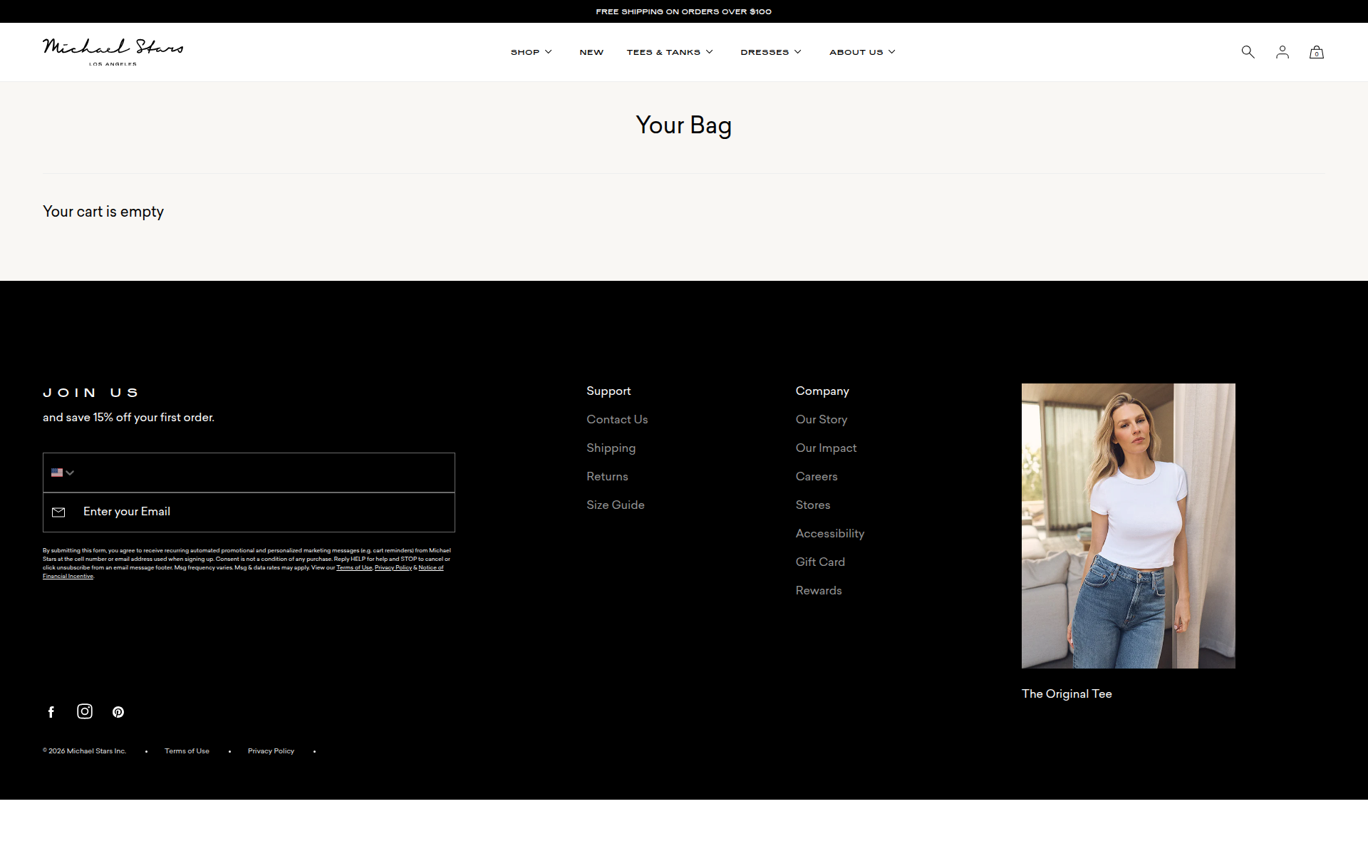
Announcement Bar
announcement-barThe top section displays a thin announcement bar with the text 'FREE SHIPPING ON ORDERS OVER $100'.
Simple, sans-serif typography. White text on a black background.
Navigation
navigationThe navigation menu sits below the announcement bar and includes the brand logo, primary navigation links, and icons for search, account, and cart.
The brand logo is left-aligned. Navigation items are horizontally aligned. Minimalist icons are used for search, account, and cart.
Your Bag
add-to-cartThis section displays the page title, 'Your Bag', and a message stating 'Your cart is empty.'
The title uses a larger, bold font. The message indicating the empty cart uses a regular font. The background is a light cream color.
Footer
footerThe footer area contains multiple columns with links for 'Join Us' with a newsletter signup form, 'Support', 'Company', social media icons and copyright information.
The background is black. The text is white. The newsletter signup has input field. Social media icons are simple and line-based. Standard footer layout.
Summary
The cart page uses a clean and simple design, consistent with the overall minimal aesthetic of the store. The black and white color scheme adds a touch of sophistication. Because the cart is empty, the main content displays a simple message indicating that status.